Table of Contents
- Start With Spatial Planning and a Curated Vision
- Interior Design Trends 2026: What’s Actually Worth Adopting
- How to Choose a Color Palette for Home That Lasts Beyond the Season
- Best Interior Design Software for Homeowners Planning a Renovation
- Professional Room Design Tips for Small Spaces and Tight Budgets
- Smart Home Integration and Wellness-Focused Design
- Professional Room Design Tips: Mistakes That Undo Expensive Decor
- Conclusion
- Frequently Asked Questions
Last Updated: September 12, 2026
Start With Spatial Planning and a Curated Vision
Professional room design tips 2026 begin with one unglamorous truth: rooms that photograph beautifully are planned first, not decorated first. At Verra Luxe Home, we see it constantly, a space always traces back to layout decisions made before a single piece was purchased.
Spatial planning means mapping how people move, gather, and rest in a room before deciding what fills it. Get it wrong and no amount of expensive decor fixes a room that fights its own traffic flow.
Before buying anything, sketch the room and mark three things: doorways and walking paths, the natural focal point, and where light lands during the day. Most homeowners skip this, then wonder why a sofa never works where they put it.
A curated vision means choosing a direction and committing to it. Pull five to eight reference images that share a mood, not just a color, if your references don’t agree, your room won’t either.
Measure your largest furniture footprint in cardboard and lay the cutouts on the floor for a week before buying. It sounds excessive. It prevents the single most expensive mistake in home decorating.
Interior Design Trends 2026: What’s Actually Worth Adopting
Interior design trends 2026 split into two camps: trends that improve how a room functions and trends that only improve how it photographs. Adopt the first; treat the second with suspicion.
The shift toward neuro-responsive design is the one worth your attention. It considers how lighting, texture, and layout affect calm and focus, not just aesthetics. A room designed around how you actually feel in it will outlast any color-of-the-year cycle.
Nature-Inspired and Biophilic Design
Biophilic design brings natural elements indoors: live plants, wood grain, stone, water features, and above all, daylight. A restorative room usually contains something living or something that once was.
You don’t need a renovation budget. A single large plant, a wool throw, and a wooden bowl do more than a wall of artificial greenery, prioritize one real, high-quality natural material over five faux ones.
Curved Forms, Organic Silhouettes, and Tactile Surfaces
Curved furniture and organic silhouettes soften rooms that are otherwise all right angles. A rounded chair, an arched mirror, or a kidney-shaped coffee table breaks the grid without repainting anything.
Pair curves with tactile surfaces. Texture is what your eye reads as depth and the cheapest way to make a room feel considered, mix smooth with nubby, matte with subtle sheen. Texture contrast does more work in most well-designed rooms than color ever does.
If a room feels flat and you can’t identify why, it’s usually a texture problem, not a color problem. Add one rough, one smooth, and one woven surface before you consider repainting.
How to Choose a Color Palette for Home That Lasts Beyond the Season
Choosing a color palette for home that survives past one season comes down to one rule: build from earthy tones and neutrals, then add color in pieces you can move. The 2026 twist is that neutrals have warmed and deepened, the cool grays of the previous decade now read dated.
Start with two to three muted neutrals for walls, large furniture, and rugs, your constants. Then add one or two accent colors through art, cushions, and accessories you can swap when your taste shifts. That structure is why a well-planned room still looks intentional years later.
The 2026 Palette Direction
The palettes gaining traction for 2026 cluster into three families, and most practitioners work within one rather than inventing from scratch:
- Warm earth: clay, terracotta, mushroom, warm oatmeal, and a deep olive as the anchor. Most forgiving for rooms with limited natural light, because the warmth compensates for the cool cast of north-facing windows.
- Muted mineral: soft sage, dusty blue, warm stone, and a chalky off-white. Cooler than the earth family but still desaturated, which keeps it from feeling clinical.
- Deep and grounding: chocolate brown, charcoal, and a single saturated accent (burnt orange, oxblood, or forest green). Best in small doses, one accent wall, one upholstered piece, or one large rug.
Notice what is absent: pure white walls paired with cool gray, and high-contrast black-and-white schemes. Both read as pre-2020 in most residential settings now.
The 60-30-10 Split, Applied Honestly
The classic 60-30-10 rule still holds: 60 percent dominant (walls, large upholstery, rug), 30 percent secondary (curtains, a secondary furniture piece, large artwork), 10 percent accent (cushions, ceramics, hardware) (asid.org). Most homeowners invert it, treating the accent as the star. If your accent covers more than about a tenth of the visible surface, it stops being an accent and becomes the palette.
Budget-Conscious Palette Swaps
You don’t need to repaint to shift a palette. Ranked from least to most expensive, the highest-impact moves are:
- Swap textiles first. Cushion covers, a throw, and a runner can shift a room’s perceived palette for well under the cost of a gallon of paint.
- Change the hardware. Cabinet pulls, curtain rods, and switch plates in a warm metal (brass, bronze) versus a cool one (chrome, nickel) change how the surrounding color reads.
- Repaint one wall, not four. A single accent wall behind the focal point delivers most of the palette shift at a quarter of the cost and labor.
- Repaint fully last. Only commit to a full repaint once you have lived with the cheaper swaps for a few weeks.
Small-Space Palette Adjustments
In a compact room, the 60-30-10 split compresses. One accent color on a large piece, a sofa, a rug, curtains, reads as more color than the same accent scattered across small objects. Keep the dominant and secondary tones within two shades of each other and let the accent do all the contrast work, so the room doesn’t feel chopped into zones.
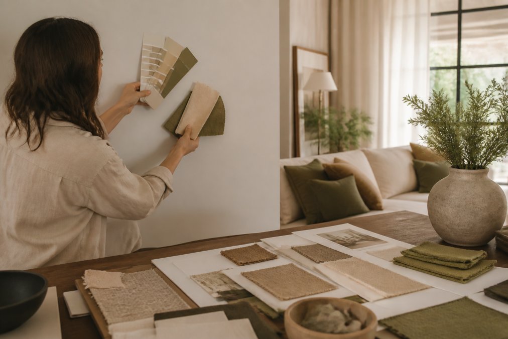
Test every color in the actual room, on the actual wall, at three times of day. Paint chips lie under store lighting. A color that reads warm at noon can turn gray by evening. Paint a swatch at least a foot square, a small chip gives your eye too little surface to judge.
For guidance on how light and color interact in interior environments, the American Society of Interior Designers resource library is a solid starting reference.
If you can only make one palette change this year, warm your neutrals. Swapping a cool gray for a warm oatmeal or mushroom shifts a room’s era more than any accent color will.
Best Interior Design Software for Homeowners Planning a Renovation
The best interior design software for homeowners is the one you’ll actually use before you buy, not the one with the longest feature list. Most people need three things: a floor plan tool, true-scale furniture placement, and a realistic view of the finished room.
Free and low-cost options cover this well. Look for dimension import, true-scale furniture, and 3D viewing. Some platforms now include virtual displays that render your paint and flooring under different lighting, solving the guesswork of how a finish will read in your space.
Skip anything requiring a learning curve longer than an afternoon. The goal is a decision aid, not a second job. If you’re working with a designer, ask what file format they prefer before you start building.
| Planning Task | What to Look For | Skip If |
|---|---|---|
| Floor plan drawing | Dimension import, wall snapping | You already have architectural plans |
| Furniture layout | True-to-scale catalog | You prefer cardboard cutouts |
| Color and finish preview | 3D rendering with lighting | You’re testing physical samples |
| Budget tracking | Line-item costing | You’re working room by room |
Professional Room Design Tips for Small Spaces and Tight Budgets
Small spaces and tight budgets aren’t a compromise, they’re a design brief, and often a sharper one. When every object has to earn its place, rooms come out better.
The core move is intentional layering: fewer pieces, each doing more work. One sculptural lamp beats three generic ones, and a single oversized artwork beats a gallery wall of small prints that add noise without interest.
Modular Furniture and Multipurpose Layouts
Modular furniture adapts as your needs change, which matters most in a small room. A sectional that reconfigures, a coffee table with hidden storage, a desk that folds into a console, each solves two problems with one footprint.
Adaptive living is the principle behind it. Design for the version of your life that shifts, not the one frozen on moving day.
DIY Integration Without the Pinterest Fail
DIY works when it’s small, structural, and honest about your skill level. It fails when it’s ambitious, decorative, and copied from a photo with no context.
Pick projects that improve function: painting, swapping hardware, installing shelving on a wall you’ve measured twice. Leave upholstery, custom millwork, and anything load-bearing to professionals. A well-hung shelf looks intentional. A crooked one undoes the room.
The most common DIY mistake is scaling a project from a photo without measuring your own space. A gallery wall sized for a twelve-foot wall looks sparse and accidental on a nine-foot one.
Smart Home Integration and Wellness-Focused Design
Smart home integration should disappear into the room, not announce itself. The best installations are the ones guests never notice: ambient lighting that warms in the evening, a thermostat that adjusts without input, motorized shades that open with the morning.
Wellness-focused design overlaps heavily here. Lighting temperature affects how a room feels at night. Ergonomic furniture affects how long you can comfortably use a space. A home sanctuary isn’t built from gadgets; it’s built from systems that quietly reduce friction.
The rule: automate what you’d otherwise do manually and forget. Skip anything you’d need an app to remember you own.
The Three Systems Worth Automating First
Most smart-home spending goes to devices abandoned within a year. Three categories consistently earn their place:
- Lighting. Tunable-white bulbs and dimmers that shift from cooler (around 4000K) during the day to warmer (around 2700K) in the evening (energy.gov). The single highest-impact smart upgrade for how a room feels, because it changes the room’s character rather than adding another screen or speaker.
- Shading. Motorized shades that follow sunrise and sunset. In rooms with strong western exposure, automated shades reduce afternoon heat gain and glare without you thinking about it.
- Climate. A smart thermostat with room sensors. The value is not the app, it is that the system stops heating or cooling an empty room.
Everything else, voice assistants, smart mirrors, connected appliances, is optional and should be judged on whether it removes a task you actually perform.
Wellness Design Beyond Gadgets
Wellness-focused design is mostly not technology. The evidence-backed levers are unglamorous:
- Daylight access. Position the primary seating so at least one person can see a window without turning. This is a layout decision, not a purchase.
- Circadian lighting rhythm. Bright and cool in the morning, dim and warm after sunset. You can achieve most of this with dimmers and warm bulbs, no hub required.
- Acoustic softening. Hard surfaces, glass, stone, drywall, bounce sound and raise perceived stress. A rug, curtains, and one upholstered piece measurably reduce echo in a typical room.
- Air and greenery. A few well-chosen plants and a basic air filter do more for perceived freshness than any scent diffuser.
Budget Tiers for Smart + Wellness Upgrades
You don’t need a full system to get most of the benefit. A practical sequence:
- Start with bulbs and dimmers. Replacing the bulbs in your most-used room with tunable-white options and adding a dimmer is the lowest-cost, highest-impact step.
- Add a smart plug for lamps. This gives you scheduled lighting without replacing fixtures.
- Add motorized shades only in the rooms where glare or heat is a real problem. They are the most expensive of the three core systems and the least worth doing everywhere.
- Add a thermostat with room sensors last, once the lighting and shading habits are established.
Small-Space Considerations
In a compact room, smart devices compete for outlets and wall space. Favor devices that replace something rather than add to it: a smart plug instead of a new lamp, a tunable bulb instead of a new fixture, one hub instead of five apps. Be honest about whether a device solves a problem you have or one a marketing page invented, in a small room, every added object has a visible cost.
The most common smart-home regret is buying devices that each require their own app. Before you buy, check whether the device works with a platform you already use. Five apps for five devices is not a smart home, it is a second job.
Renters and small-space dwellers who want the wellness benefits of circadian lighting and acoustic softening without permanent installation or landlord approval.
Professional Room Design Tips: Mistakes That Undo Expensive Decor
The most expensive room in a house can still look cheap, and the culprit is almost always one of a handful of recurring mistakes.
- Buying pieces individually without a plan. Each item looks good alone and clashes in place. This is the single most common regret we hear from homeowners.
- Ignoring scale. Furniture sized for a showroom overwhelms a modest room. Measure the room, then measure the furniture.
- Overloading a focal point. One strong feature per room. Two competing ones cancel each other out.
- Skipping the lighting layer. Overhead light alone flattens everything. Add a floor lamp, a table lamp, and a task light.
- Filling every surface. Empty space is part of the design, not a gap to be filled.
Aesthetic cohesion separates a curated room from a collection. It comes from restraint, not from spending more.
Homeowners who have already bought several statement pieces and need help making them work together rather than starting over.
Conclusion
The hardest part of designing a room isn’t choosing the pieces, it’s resisting the urge to buy before you’ve planned, and holding a single vision when a hundred good options compete for your attention. That discipline turns a house into a home sanctuary rather than a showroom.
Verra Luxe Home curates premium decor built around exactly that idea: pieces that blend artistic elegance with practical functionality, crafted for beauty and durability so they hold up in a real home. Our collection is designed to work together, so you’re not left guessing whether the pieces you love will cohere.
Get started with Verra Luxe Home and build a space that reflects your taste and lasts well beyond the season.
Frequently Asked Questions
What is the 3-5-7 rule in interior design?
The 3-5-7 rule is a proportion guideline for arranging decor: three of one item (like small vases), five of a medium element (like books or candles), and seven of a smallest accent (like stems or trinkets). It creates visual balance without looking cluttered. Use it on shelves, mantels, and coffee tables to give a curated, intentional feel that reads as professional rather than accidental.
What are the defining interior design trends for 2026?
The strongest interior design trends 2026 include biophilic design, curved organic silhouettes, tactile surfaces, and wellness-focused layouts. Earthy tones and botanical motifs are replacing stark minimalism, while modular furniture supports adaptive living. Smart home integration is now expected rather than optional. The overall shift favors handcrafted, sustainable materials and curated spaces that feel like a home sanctuary.
How do I balance functionality and aesthetics in 2026 home design?
Start with spatial planning before buying anything. Map traffic flow, seating needs, and storage gaps, then choose pieces that solve those problems while matching your palette. Modular furniture and functional decor handle double duty. Ergonomic design matters as much as visual interest, so test layouts with painter’s tape or design software before committing to large purchases.
What are the most popular color palettes for 2026 interiors?
Earthy tones dominate: warm terracotta, mushroom, olive, and soft clay paired with creamy neutrals. Deep greens and muted blues appear as grounding accents. For contrast, designers layer texture rather than color, using tactile surfaces like bouclé, linen, and raw wood. Choose a palette that complements your existing architectural details so the result feels cohesive rather than themed.
How can Verra Luxe Home decor pieces enhance a professional room layout?
Verra Luxe Home curates premium decor that blends artistic elegance with practical functionality. Each piece is chosen to work cohesively with others, which solves the common problem of items that look great alone but clash together. For a professional room layout, start with your color palette and spatial plan, then layer in exclusive pieces that add visual interest without overwhelming the space.
Do I need design software to plan a room, or can I do it manually?
Software helps, but it is not required. The best interior design software for homeowners offers 3D rendering and virtual displays that prevent costly mistakes before you buy. If you prefer manual planning, measure your room, sketch a floor plan on graph paper, and use painter’s tape to mark furniture footprints. Either method works if you commit to spatial planning before purchasing.
How do I make small spaces feel intentional rather than cramped?
Focus on vertical storage, multipurpose furniture, and a restrained color palette. Choose a few larger statement pieces instead of many small ones, which reduces visual noise. Mirrors and ambient lighting add depth. Modular furniture adapts as your needs change, and keeping surfaces clear makes even compact rooms feel curated rather than crowded.