Table of Contents
- Start With the Room’s Purpose and Atmosphere
- How to Choose Art Size for Your Wall
- Color Palette, Tone, and Visual Balance
- How to Arrange Wall Art for Maximum Impact
- Framing, Matting, and Lighting Your Art
- Art Maintenance, Preservation, and the Psychology of Placement
- Best Places to Buy Affordable Art (and What to Look For)
- Choosing Art for Home: Putting It All Together
Last Updated: August 16, 2026
Choosing art for your home feels deceptively simple until you’re standing in a gallery, suddenly paralyzed by scale, color, and cost. At Verra Luxe Home, we offer a sophisticated and inspiring collection of premium decor, and the biggest mistake we see is treating art selection as purely emotional. There’s a craft to it. Below, we’ll walk you through every dimension of how to choose art for home, from reading a room’s atmosphere to sourcing ethically, so your walls tell a story you’ll still love in a decade.
The throughline is this: great art selection is about alignment, not accumulation. Every decision you make should serve the room’s purpose and your visual identity.
Start With the Room’s Purpose and Atmosphere
The function of a room is the clearest signal for what kind of art belongs in it. A living room built for conversation calls for different visual energy than a home office designed for focus, or a bedroom meant for rest.
Think of the atmosphere you want first, then work backward to the art. Calming bedrooms benefit from soft tonal work: muted watercolors, abstract washes, or understated photography. Dining rooms can absorb bolder, more provocative pieces because meals are social events. Home offices often do well with structured, geometric compositions that reinforce order without distraction.
One practical framework: write down three adjectives describing how you want the room to feel, then use those words as a filter when evaluating any piece.
Match the Medium to the Mood
Medium matters more than most guides acknowledge. Oil paintings carry weight and formality. Watercolors read as light and airy. Photography can swing between clinical and deeply personal. Sculpture and three-dimensional wall art introduce texture and shadow that flat prints cannot replicate.
For rooms where warmth and tactility matter, canvas originals or textured mixed-media pieces create presence that poster prints never will. For modern, minimal spaces, photography with clean lines integrates more naturally. The medium is part of the message.
How to Choose Art Size for Your Wall
Choosing the right art size is the single most common place people go wrong. Too small, and a piece looks lost. Too large, and it overwhelms the architecture. Aim for art that fills roughly 60 to 75 percent of the available wall width.
The Two-Thirds Rule for Furniture and Wall Space
The two-thirds rule is reliable for art hung above furniture: the artwork should span approximately two-thirds the width of the piece below it. Above a six-foot sofa, that means art roughly four feet wide. This creates visual cohesion between furniture and wall, making the vignette read as composed rather than random.
The rule applies to beds, consoles, sideboards, and desks. When a space feels "off," a proportion mismatch is usually the culprit. According to The American Society of Interior Designers’ guidance on [wall art(/shop/modern-led-elephant-wall-art-luminous-abstract-canvas-painting/) placement | asid.org], proportion is consistently cited as the most common error homeowners make.
| Wall/Furniture Scenario | Recommended Art Width | Notes |
|---|---|---|
| Above a 6-ft sofa | ~4 ft (two-thirds) | Single piece or grouped arrangement |
| Above a queen bed | ~40-48 inches | Centered, or split into diptych |
| Standalone wall, no furniture | 60-75% of wall width | Anchor with furniture below if possible |
| Narrow hallway | 12-18 inches wide | Vertical orientation works best |
| Above a console or sideboard | Two-thirds of console width | Leave 6-8 inches above surface |
Color Palette, Tone, and Visual Balance
Color is where art selection gets genuinely interesting. The conventional wisdom says to match your art to your room’s palette, but perfectly matched art disappears. What you actually want is color that coordinates without camouflaging.
Pull one or two colors from the room’s existing palette and look for art that includes those tones without being dominated by them. A room with deep navy accents doesn’t need a navy painting; it needs a piece where navy appears as a supporting element. This creates cohesion without monotony.
Contrast, handled deliberately, gives a room visual energy. A warm-toned room with amber, terracotta, and cream can absorb a single piece with cooler, muted blues. The key is intentionality. Random contrast reads as a mistake; intentional contrast reads as design.
Tone matters as much as hue. A high-contrast black-and-white photograph carries different visual weight than a soft-focus monochrome print. Assess the tonal range of any piece before committing.
Before purchasing, photograph your room and apply a color filter in your phone’s photo editor to see which tones are dominant. This makes it easier to identify what a new piece needs to contribute.
How to Arrange Wall Art for Maximum Impact
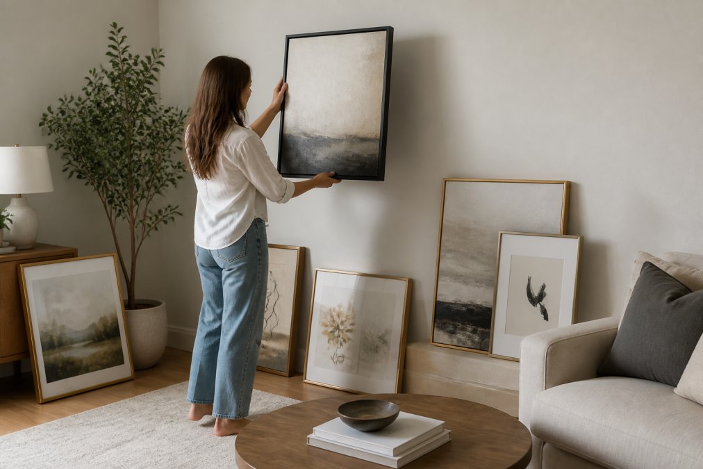
Arranging wall art well is less about rigid rules and more about understanding visual weight. Every piece has it, determined by size, color intensity, frame darkness, and subject matter. A successful arrangement distributes that weight in a way that feels balanced.
Start by laying your pieces on the floor in your intended arrangement. This lets you see the composition as a whole before committing a nail to drywall. Adjust until the grouping feels resolved, with no single piece pulling too hard in one direction.
Building a Gallery Wall With Cohesion
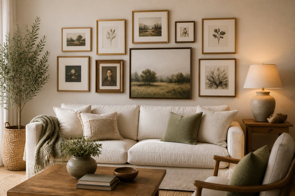
A gallery wall works when it has a unifying principle: consistent color palette, shared medium, or repeating frame finish. Without at least one unifying element, a gallery wall reads as clutter rather than curation.
The most reliable approach: choose one frame finish (black, natural wood, or antique gold) and vary the sizes and orientations of pieces within it. This gives visual variety while maintaining enough discipline to read as intentional. Start with your largest piece slightly left of center, then add smaller pieces around it, keeping gaps between frames consistent at three to four inches.
Hanging Height and Eye-Level Placement
The standard recommendation is to position the center of artwork at 57 to 60 inches from the floor, roughly eye level for standing viewers. As documented in Smithsonian Institution’s guidelines for art display and installation, 57 inches to center is the standard across professional exhibition contexts.
In residential spaces, modify this rule: if art will primarily be viewed from a seated position, lower it to around 48 to 52 inches. Art hung above a sofa at gallery height always feels disconnected from the furniture below.
Never hang art based on hook position alone. Measure from the floor [to the](/shop/modern-nordic-led-wall-sconce-luxury-acrylic-art-light-for-living-rooms-and-bedrooms/) center of the piece every time. A one-inch error at hanging height is invisible in isolation but glaring when multiple pieces are hung inconsistently.
Framing, Matting, and Lighting Your Art
Framing is where a good piece becomes a great one. The frame should serve the artwork first and the room second.
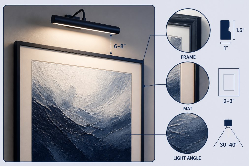
For original art and high-quality prints, UV-protective glass is worth the cost. Standard glass reflects light and can shift perceived color. UV glass reduces glare and protects from light-induced fading. Matting adds visual breathing room; a wider mat (three to four inches) reads as more refined than a narrow one.
Lighting transforms how art reads in a space. Picture lights mounted to the frame offer focused illumination. Track lighting gives flexibility as your collection evolves. Use bulbs with a color rendering index (CRI) of 90 or above to avoid color distortion.
Art Maintenance, Preservation, and the Psychology of Placement
Art maintenance separates casual collectors from those who build lasting collections. The enemies of art are light, humidity, temperature fluctuation, and physical contact. Position pieces away from direct sunlight and HVAC vents.
For cleaning, use a soft dry cloth on frames. Never use liquid cleaners near artwork. Canvas works can be gently dusted with a soft natural-bristle brush. For significant cleaning, consult a professional conservator through the American Institute for Conservation’s directory of art conservators.
Research in environmental psychology shows art affects mood, perceived room size, and cognitive performance. Figurative art with human subjects creates social presence. Abstract work with organic forms lowers perceived stress. Landscapes are associated with restorative attention, making them ideal for rest spaces.
Place your most personally meaningful piece where you’ll see it first thing in the morning or last thing at night. Emotional resonance compounds with repeated exposure.
The psychology of placement is as important as proportion and color. Art at eye level from your most-used seating position shapes your daily experience more than any formal statement piece on a distant wall.
Best Places to Buy Affordable Art (and What to Look For)
Artist-direct platforms and independent galleries offer the most direct relationship between buyer and maker, typically meaning better provenance documentation. Print-on-demand services offer accessibility, but quality varies; always check paper or canvas weight, ink type, and whether materials are archival.
Auction houses can yield original work at prices below gallery retail. Estate sales are underrated sources for original art with genuine character.
Verra Luxe Home’s curated collection addresses a specific gap: pieces designed to work cohesively within a broader interior, not just as standalone objects.
Sustainable and Ethical Sourcing
Sustainable sourcing means understanding where materials come from: sustainable forestry certification for wooden frames, non-toxic inks for prints, and canvas made from organic or recycled fibers.
Ethical sourcing extends to the human dimension. When buying from artists, understand how the transaction is structured. Direct artist sales ensure fair compensation. For framing materials, look for Forest Stewardship Council (FSC)-certified wood, a verifiable standard increasingly available through quality framers.
Choosing Art for Home: Putting It All Together
The process of choosing art for home is ultimately a practice of alignment: matching scale to architecture, tone to atmosphere, and personal meaning to daily experience. These principles are frameworks, not rigid rules.
Start with the room’s purpose. Establish size parameters using the two-thirds rule. Build your color strategy around coordination. Hang at eye level for the primary viewing position. Frame with intention and light with care. Source from places that can tell you the story behind the piece.
The result is a space that reflects something specific about who lives in it.
Building an art collection that holds together over time takes both taste and knowledge. Verra Luxe Home’s curated collection of premium decor is designed for homeowners who want pieces that work cohesively, not just individually beautiful objects that fight each other on the wall. Each piece is thoughtfully selected to blend artistic elegance with practical durability, so what you choose today still feels right five years from now. Shop Now at Verra Luxe Home and find the pieces that make your space unmistakably yours.
Frequently Asked Questions
How do you determine the right size art for a wall?
A reliable starting point is the two-thirds rule: your artwork should cover roughly two-thirds of the wall or furniture it sits above. For a 60-inch sofa, that means a piece or grouping spanning about 40 inches. Always measure the wall and tape out the dimensions on the floor before buying. Scale matters more than any other single factor when choosing art for home, because an undersized piece makes the whole room feel unfinished.
Should art match the furniture in a room?
Art does not need to match furniture exactly, but it should share at least one visual connection, a color pulled from the upholstery, a texture that echoes the wood grain, or a tone that reinforces the room's overall palette. Contrast is healthy; a bold abstract canvas can look striking above a traditional wooden console. The goal is cohesion, not uniformity. Repeating one or two complementary colors across your art collection and furnishings creates visual balance without making the room feel matchy.
What is the best height to hang wall art?
The standard is to center artwork at 57 to 60 inches from the floor, which approximates average eye level. In rooms where people are usually seated, dining rooms, home offices, lower the center point to around 54 to 56 inches so the art reads well from a seated position. When hanging art above furniture, leave 6 to 8 inches of space between the top of the piece and the bottom of the frame to keep the grouping visually anchored.
How do you mix different styles of art in one home?
Mixing styles works when you establish a unifying thread, consistent framing finishes, a shared color palette, or a common scale. A black-and-white photograph, a colorful abstract print, and a small sculpture can coexist if their frames are all the same metal finish, for example. Vary the mediums deliberately: canvas, prints, and sculpture add texture and depth to an art collection. Avoid clustering all your bold pieces in one room; distribute statement works so each space has its own focal point.
This article was written using GrandRanker