Table of Contents
- Interior Design Rules for Beginners Worth Knowing First
- How to Choose a Color Scheme for Your Home
- Decorating Tips for Non-Designers: Typography, Layout, and Visual Hierarchy
- Mastering White Space, Alignment, and Grid Systems
- Common Interior Design Mistakes to Avoid
- Accessibility, AI Tools, and File Formats: Decorating Tips Most Guides Skip
- Consistency, Iteration, and Knowing When a Room Is Done
- Conclusion
Last Updated: August 15, 2026
Interior Design Rules for Beginners Worth Knowing First
Most decorating tips start in the wrong place, handing you a mood board and telling you to "trust your instincts." That advice collapses the moment you’re standing in a furniture showroom trying to decide whether a sectional fits your living room.
Start with rules instead. Not because rules constrain creativity, but because they give you a framework to break them intelligently. According to the American Institute of Architects’ design resources, proportion and scale are the two most common areas where residential spaces go wrong. Understanding both before you buy anything is the single most valuable thing you can do.
The 70/30 Rule and Visual Balance
Visual balance means a room feels stable without looking static. The 70/30 rule is the most practical shortcut: 70% of the room’s visual weight should come from a dominant element or tone, and 30% from accents and contrast.
Your sofa, rug, and largest wall treatment form the 70%. Throw pillows, artwork, and decorative objects form the 30%. Violate this ratio and rooms feel either monotonous or chaotic.
Scale, Proportion, and Focal Points
Scale is the relationship between objects and the room. Proportion is the relationship between objects and each other. Both matter.
Every well-designed room has a focal point, a fireplace, statement artwork, or architectural feature that draws the eye first. If your room lacks one, create it: a large-format piece hung at eye level (approximately 57 inches from floor to center) is the most reliable method. Stand at the room’s entrance and note where your eye goes first. If nowhere in particular, the room lacks a focal point and will feel unresolved.
How to Choose a Color Scheme for Your Home
Choosing a color scheme is not about picking colors you like. It is about creating a sequence of visual decisions that holds together across lighting conditions, materials, and time of day.
Understanding Color Psychology and Palettes
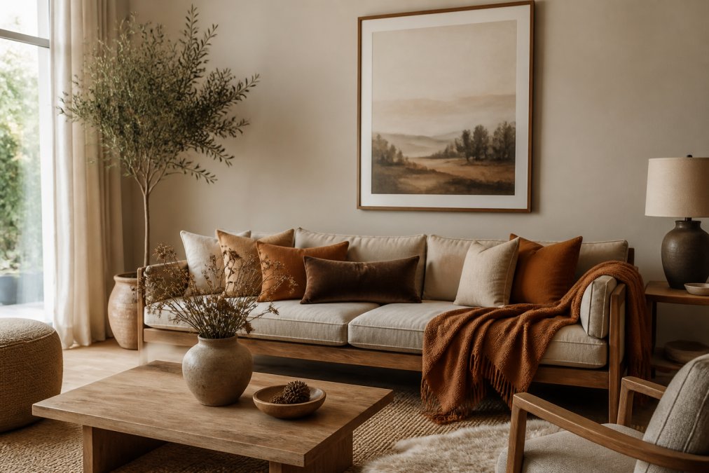
Color psychology studies how hues affect mood and perception. Warm tones (terracotta, amber, deep cream) create intimacy and energy. Cool tones (sage, slate, dusty blue) read as calm and expansive. Neutral palettes anchor both.
The most reliable structure for non-designers is the 60-30-10 palette:
- 60%, dominant color (walls, large upholstery)
- 30%, secondary color (drapery, secondary seating, rugs)
- 10%, accent color (cushions, objects, art)
This ratio creates visual hierarchy without formal design training. The key is committing to it. Many rooms fail because homeowners keep adding accent colors until the 10% becomes 40%.
As documented in Color Marketing Group’s research on residential color trends, warm neutrals and earth-toned palettes have consistently outperformed trend-driven color choices for long-term satisfaction.
Using Hex Codes and Swatches to Test Before You Commit
Paint manufacturers publish hex codes for every color. Pull hex codes for your shortlisted wall colors and view them on your phone next to existing furniture and fabrics. It eliminates obvious mismatches before you buy paint.
Better: order physical swatches and pin them at different heights. View them in morning light, afternoon light, and under artificial lighting. Colors shift dramatically across conditions.
Order at least three paint samples for any wall color you’re seriously considering. Paint a 12-by-12-inch patch directly on the wall rather than on card. Card stock reflects light differently than a painted surface.
Decorating Tips for Non-Designers: Typography, Layout, and Visual Hierarchy
This applies to gallery walls, custom signage, framed prints with text, and decorative objects with lettering.
Visual hierarchy arranges graphic elements so the viewer’s eye moves through them in deliberate order. For typography, the core rules are:
- Limit typefaces to two. One serif for display text. One sans-serif for body text. More than two creates visual noise.
- Size signals importance. The largest text should be most important.
- Contrast drives readability. Dark text on light backgrounds and light text on dark backgrounds.
- Alignment creates order. Left-aligned reads formal. Centered works for display applications. Avoid justified text in short-line decorative applications.
A serif typeface carries historical weight and warmth. A sans-serif reads as modern and clean. Knowing which register you want helps you choose.
Mastering White Space, Alignment, and Grid Systems
The biggest mistake non-designers make is filling every surface. Negative space is not empty space, it is an active design element that gives other elements room to breathe and be seen.
In a room, negative space is the visible wall between frames in a gallery, the open floor around a rug, the gap between objects on a shelf. Maintain it deliberately and even modest pieces look curated.
Alignment is the invisible grid that holds a composition together. On a gallery wall, align frame bottom edges along a consistent horizontal line, or center them on a shared vertical axis. Either works. Randomness does not.
A practical grid system for shelf styling:
| Zone | Content | Principle |
|---|---|---|
| Back left | Tall vertical object (vase, stack of books) | Anchors height |
| Center | Medium focal piece (sculpture, framed art) | Draws the eye |
| Front right | Small horizontal object (tray, object) | Creates depth |
| Negative space | Deliberate gap | Prevents clutter |
This three-zone approach applies to mantels, console tables, and open shelving. Vary heights, maintain negative space, and the composition will hold.
Negative space is not something you add after the fact. Plan for it before placing objects. If every surface is full, remove pieces until the remaining ones can be seen individually.
Common Interior Design Mistakes to Avoid
Furniture too small for the room. A sofa that floats in the middle of a large living room makes the room feel underdecorated. Scale furniture to the room.
Rugs too small. The front legs of every major seating piece should sit on the rug.
Artwork hung too high. The center should be at approximately 57 inches from the floor.
Ignoring the ceiling. Ceiling height affects every proportion decision. Low ceilings benefit from vertical lines. High ceilings can carry taller furniture and bolder graphics.
Matching everything too precisely. A room where every wood tone, metal finish, and fabric texture matches reads as a showroom, not a home. Intentional contrast creates visual interest.

Avoid buying an entire room’s worth of furniture from a single collection in one purchase. It eliminates the layering and contrast that makes a space feel personal rather than assembled.
Accessibility, AI Tools, and File Formats: Decorating Tips Most Guides Skip
Most decorating guides stop at color and proportion. The following three areas matter more than most homeowners realize.
Accessibility Standards for Home Decor Decisions
The ADA Standards for Accessible Design establish minimum clearance and reach requirements. Even if your home is not subject to ADA compliance, these standards are excellent practical benchmarks.
Key accessibility considerations:
- Pathway clearance: Maintain at least 36 inches of clear passage between furniture pieces.
- Contrast for visibility: High contrast between floors and walls helps occupants with low vision navigate safely.
- Lighting levels: Layer ambient, task, and accent lighting so the room functions at different times of day.
- Reach zones: Reserve display shelving above 48 inches for purely visual elements that do not need to be handled.
Accessibility is not a constraint on good design. Every principle produces a better-looking room as a side effect.
AI-Assisted Design Workflows for Homeowners
AI design tools allow you to upload a photo of your room and receive generated layout alternatives, color palette suggestions, and furniture recommendations within minutes.
The practical workflow:
- Photograph your room from the doorway at standing height.
- Upload to an AI design tool and specify your style preference and budget.
- Review generated options as a starting point, not a final answer.
- Use the output to identify proportions and color directions worth testing.
- Validate any specific piece recommendations against your actual room dimensions before purchasing.
AI tools are strong at generating options quickly. They are weaker at accounting for how materials feel, how light changes through the day, and how a room functions for the people who live in it. Use them to accelerate iteration, not to replace judgment.
For file formats: if ordering custom prints, signage, or framed artwork, request vector files (SVG, AI, EPS) rather than raster files (JPG, PNG) for text-heavy or line-based graphics. Vector files scale without quality loss. For photographic prints, request files at a minimum of 300 DPI at the intended print size.
Consistency, Iteration, and Knowing When a Room Is Done
Consistency in design elements does not mean repetition. It means each element shares a common logic, a material palette, color temperature, period reference, or level of formality.
A room with mixed signals reads as unresolved. Eclectic rooms work when the designer has a clear point of view connecting disparate elements.
Practical iteration approach:
- Set the room with primary pieces and live with it for two weeks.
- Note what you walk past without noticing (not working) and what draws your eye consistently (working).
- Remove one element that is not working and replace it with something that shares the logic of what is.
- Repeat until the room feels resolved.
A finished room is one where you stop noticing individual pieces and start experiencing the room as a whole. If your eye keeps snagging on something, the room is not done.
Verra Luxe Home’s curated collection is built around this principle: each piece is selected not just for individual beauty, but for how it functions within a broader composition. The curation does the connective work that most homeowners find most difficult.
The challenge most homeowners face is not a lack of taste. It is the absence of a framework that translates good instincts into consistent decisions. Verra Luxe Home offers a thoughtfully curated collection of premium decor designed to work together from the start, blending artistic elegance with practical functionality so your space feels intentional rather than assembled. Every piece is crafted for beauty and durability, chosen to hold up in real homes and real lives. Shop Now and start building a room that feels genuinely yours.
Frequently Asked Questions
What is the 70/30 rule in interior design?
The 70/30 rule divides a room's visual composition: 70% goes to a dominant element, typically your main furniture or wall color, and 30% goes to accent pieces, contrasting tones, or decorative objects. This ratio creates visual balance without making a space feel monotonous. For example, if your sofa and rug share a warm neutral tone, your 30% accent might be a bold art piece or a contrasting throw. Applying this rule is one of the most reliable decorating tips for non-designers because it removes guesswork from composition.
What are the most common interior design mistakes beginners make?
The most frequent mistakes include hanging artwork too high, choosing a rug that is too small for the seating area, mixing too many competing patterns without a unifying color palette, and ignoring scale when selecting furniture. Many beginners also skip the planning stage and buy individual pieces before establishing a cohesive color scheme, which leads to rooms that feel disconnected. Starting with a clear palette and a defined focal point before purchasing anything eliminates most of these issues.
How do I start decorating a room from scratch?
Start by identifying one anchor piece you love, whether that is a sofa, an art print, or a rug, and build your color palette from its tones. Next, establish your layout using a grid system or simple floor plan sketch before buying furniture. Focus on visual hierarchy by deciding what the room's focal point will be, then layer in secondary and accent elements. Prioritize negative space: rooms that feel expensive almost always have breathing room between pieces rather than every surface filled.
What is the best way to choose a color palette for a room?
Pull two to three colors from a piece you already own and love, such as a rug, artwork, or fabric swatch. Use color psychology as a guide: cooler tones like blues and greens promote calm, while warmer tones add energy. Test paint colors by applying large swatches to your actual wall and observing them at different times of day before committing. Digital tools that generate hex code palettes from uploaded photos can speed up this process significantly, especially for non-designers working without a professional.
This article was written using GrandRanker