Table of Contents
- What You’ll Need Before You Start
- Step 1: Identify Your Home’s Architectural Era
- Step 2: Decorating Tips for Non Designers
- Step 3: Using the 60-30-10 Rule for Color Schemes
- Step 4: How to Create a Focal Point in a Living Room
- Step 5: Balance Scale and Proportion in Home Decor
- Step 6: Mix Styles Without Visual Clutter
- Common Mistakes to Avoid When Applying Design Principles to Home Decor
- Frequently Asked Questions
Last Updated: September 15, 2026
What You’ll Need Before You Start
Applying design principles to home decor starts with four things: a clear read on your home’s architecture, a defined color scheme, a plan for focal points, and a willingness to edit. This guide walks through each step with rules you can actually use, not vague advice about “trusting your eye.”
The payoff is real. Homes with a coherent design philosophy feel calmer and more intentional, and they hold their value better when architectural integrity is respected. Below, you’ll see exactly how to apply design principles to home decor without a designer’s budget or a designer’s vocabulary.
Here’s what to gather before you move a single piece of furniture:
- A phone camera, for photographing each room from all four corners
- Paint chips or fabric swatches in your existing palette
- A tape measure and painter’s tape, for marking scale on the floor
- A notepad for listing what stays, what moves, and what leaves
Most people skip the camera step. That’s a mistake. Photos reveal proportion problems your eye forgives in person, and they make it easier to spot where a room’s focal point should sit.
Photograph each room at eye level, not from a standing height. Eye-level shots match how you actually experience the space, so scale errors show up immediately.
Step 1: Identify Your Home’s Architectural Era
Your home’s architectural era is the period style it was built in, and identifying it is the single most useful thing you can do before decorating. The era tells you which proportions, materials, and details the house was designed around.
Start with the exterior. Window shape, roof pitch, and trim depth are the fastest clues. A Colonial typically shows symmetrical windows and a side-gabled roof. Mid-century modern homes favor low profiles, wide eaves, and large panes. Inside, check door casings, ceiling height, and whether rooms flow openly or sit closed off.
Not sure? Your county property records usually list a build year, and local historical societies often publish era guides for neighborhoods. Once you know the era, period-appropriate choices stop feeling like guesswork.
Step 2: Decorating Tips for Non Designers
The best decorating tips for non designers come down to one idea: work with the house, not against it. You don’t need formal training to get this right. You need a system, and the system starts by sorting every problem in a room into one of two buckets.
Bucket one: structural constraints. These are fixed. Window placement, ceiling height, load-bearing walls, the swing of a door, the location of a radiator or return vent, the depth of a closet. You can soften them, but you cannot move them without a permit and a contractor.
Bucket two: cosmetic variables. These are yours to change. Paint, lighting, hardware, textiles, furniture, art, window treatments. Almost everything you see in a decorating magazine lives in this bucket.
The mistake non-designers make is spending cosmetic money on structural problems. No paint color fixes a low ceiling. No rug corrects a room whose traffic path cuts straight through the seating area. Before you buy anything, walk each room and label every issue as structural or cosmetic. Then spend on the cosmetic list first, because that’s where your dollar actually moves the needle.
Once you’ve sorted the room, apply these rules. They’re the ones that hold up across eras and styles:
- Pick one anchor piece per room and build outward from it. The anchor is usually the largest or most fixed element: a sofa, a bed, a rug, or a built-in. Everything else supports it.
- Repeat at least one material or color three times in a space. Three is the minimum for the eye to register a pattern rather than an accident.
- Keep primary walkways at least 36 inches wide (ADA Standards for Accessible Design Title III Regulation 28 CFR Part 36 (1991)). Secondary paths can narrow to 24 inches, but anything under 30 inches starts to feel like a squeeze in daily use.
- Hang art so its center sits at 57 to 60 inches from the floor (nga.gov). That’s standard gallery height and it matches the average adult eyeline.
- Buy the largest rug that fits the seating group, not the smallest one that works. In a living room, that usually means an 8×10 or 9×12. A 5×8 under a full sofa-and-chairs arrangement is the single most common scale error in American homes (apartmenttherapy.com).
That last point trips up more people than any other. A rug that’s too small makes a room read as unfinished, no matter how good the furniture is. If you’re coming from a bare-floors setup, expect the rug to be one of your larger line items, often more than a single accent chair.
Measure your walkways with painter’s tape on the floor before you commit to a furniture layout. Two minutes of tape saves a return shipping fee and a weekend of rearranging.
If you only do one thing from this section, do the structural-versus-cosmetic sort. It’s the difference between decorating a room and fighting it.
Step 3: Using the 60-30-10 Rule for Color Schemes
Using the 60-30-10 rule for color schemes means splitting a room’s palette into three parts: 60 percent dominant color, 30 percent secondary, and 10 percent accent. It’s a proportion guide, not a paint-by-numbers formula.
The dominant 60 percent usually lands on walls, large upholstery, or a big rug. The secondary 30 percent covers curtains, a sofa in a contrasting tone, or case goods. The accent 10 percent is where personality lives: pillows, art, ceramics, a single bold chair.
What most guides miss is that the rule applies to texture as much as color. A room that’s 60 percent smooth surfaces, 30 percent mid-weight textiles, and 10 percent rough or reflective accents reads as layered even when the palette is nearly monochrome. Texture layering is what keeps a neutral room from looking flat.
Don’t spread the accent color across five small objects in five corners. Scatter it and the eye has nowhere to rest. Concentrate the 10 percent in one or two spots instead.
Step 4: How to Create a Focal Point in a Living Room
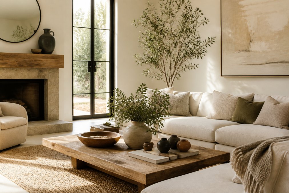
The fastest way to create a focal point in a living room is to use what’s already there. A fireplace, a large window, or a statement wall should anchor the room; furniture arranges around it, not the reverse.
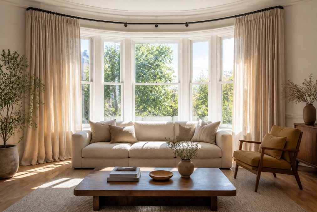
If the room has no natural anchor, build one. A large piece of art, a console with a mirror above it, or a tall bookcase all work. The rule is scale: the focal element should occupy a meaningful share of the wall it sits on, not float as a small object in a large field.
Then aim the seating at it.
Step 5: Balance Scale and Proportion in Home Decor
Use these benchmarks as a starting point:
| Element | Guideline | Common Mistake |
|---|---|---|
| Sofa vs. wall | Sofa spans 60-75% of wall length | Sofa floats mid-room |
| Coffee table height | Within 5 cm of seat height | Table sits too low |
| Rug under seating | Front legs of all furniture on rug | Rug only under table |
| Art above sofa | 20-30 cm above sofa back | Art hung near ceiling |
| Pendant over table | 75-85 cm above tabletop | Fixture crowds sightlines |
If a room feels wrong and you can’t name why, check scale before you check color. Nine times out of ten, the problem is proportion, not palette.
Step 6: Mix Styles Without Visual Clutter
The 70/20/10 Eclectic Bridge
Treat style mixing like a color palette. Assign proportions:
The Three Threads Test
Bridging Mismatched Architecture and Decor
Eclectic isn’t a style you buy. It’s a ratio you apply. Get the 70/20/10 split right and the room reads as curated. Get it wrong and it reads as a yard sale, same pieces, different math.
Common Mistakes to Avoid When Applying Design Principles to Home Decor
Other frequent errors:
Frequently Asked Questions
What is the 3-5-7 rule in decorating?
The 3-5-7 rule is a styling guideline for arranging accessories in odd-numbered groupings. Use three items for small surfaces like a side table, five for medium spaces such as a console, and seven for larger areas like a bookshelf or mantel. Odd numbers create visual tension that feels more natural than even pairings. Vary heights, textures, and shapes within each group so the arrangement reads as intentional rather than cluttered. This rule pairs well with the scale and proportion adjustments covered in this guide.
How can I identify my home decor style?
Start by pulling five to ten images of rooms that make you pause. Look for repeating elements: color palette, furniture lines, materials, and lighting. If you gravitate toward clean lines, neutral tones, and functional forms, you lean minimalist or mid-century modern. If you prefer layered textiles, warm woods, and collected objects, your taste runs traditional or eclectic. Your home’s architectural era also sets boundaries. A colonial home with ornate moldings will resist stark modern pieces unless you bridge them with transitional style choices.
How do you balance scale and proportion in a room?
Measure your room’s largest dimension and use it to set anchor piece sizes. A sofa should occupy roughly two-thirds of the wall it sits against. Coffee tables should sit 14 to 18 inches from the sofa edge. Rugs should extend at least 6 inches beyond the front legs of all seating. For lighting, a chandelier should hang 30 to 36 inches above a dining table. These ratios keep furniture from dwarfing or disappearing in a space, which is the core of applying design principles to home decor.
What makes a home look cheap?
Mismatched scale, poor lighting, and visible clutter do more damage than low price tags. A tiny rug floating in a large room, a single overhead light with no lamps, or a shelf packed with unrelated knickknacks all read as unfinished. Cheap-looking spaces often lack texture layering, relying on flat surfaces and synthetic materials with no variation. Adding one or two well-scaled, durable pieces with visible craftsmanship, even in a modest budget, elevates the entire room more than filling it with many small items.