Table of Contents
- Start With a Primary Style and a Secondary Style
- Mixing and Matching Furniture Styles Without the Clash
- Mixing Modern and Traditional Decor: Pairings That Work
- How to Choose a Color Palette for a Room
- Decorating Rules for Mixing Patterns, Textures, and Motifs
- Proportion, Placement, and the Unifying Element
- Room-by-Room Process and Common Mistakes to Avoid
- Conclusion
- Frequently Asked Questions
Last Updated: October 13, 2026
Start With a Primary Style and a Secondary Style
The fastest way to mix decor styles cohesively is to pick one dominant style and one supporting style, then let the dominant style lead about 70 percent of the room. A cohesive home is not a museum of one look, it is a controlled conversation between two.
At Verra Luxe Home, we see this constantly: homeowners fall for a showroom piece, bring it home, and wonder why it fights everything else.
A primary style is the design language that sets the mood of a room. A secondary style is the accent layer that adds interest without taking over.
The primary style decides the big pieces: sofa, rug, wall color.
Why the 70/30 Split Keeps a Room From Looking Mismatched
The 70/30 split works because the eye needs a clear leader. When two styles split a room evenly, neither wins, and the space reads as unrelated items rather than a designed room.
Here is how the split plays out in practice:
- 70 percent primary: sofa, rug, walls, large case goods
- 30 percent secondary: lighting, accent chairs, art, pillows, accessories
- Shared thread: one color, one material, or one shape that appears in both
Photograph your room in black and white before you buy anything else. If the room still reads as balanced without color, your proportions are working. If it looks chaotic, your secondary style has crept past 30 percent.
Mixing and Matching Furniture Styles Without the Clash
Mixing and matching furniture styles comes down to three shared traits: color, scale, and line.
Most guides say “match the wood tones.” That advice is outdated, modern interiors mix walnut with oak and antique brass with matte black all the time.
Before you buy, run this quick check:
- Color: Do the pieces share at least one color family?
- Scale: Are their proportions similar, or is one deliberately oversized as a statement piece?
- Line: Do the silhouettes echo each other, or contrast on purpose?
Two of three is your green light. One of three is a warning sign. Zero means the piece belongs in a different room.
A common mistake is treating contrast as a problem. It is not.
Mixing Modern and Traditional Decor: Pairings That Work
Mixing modern and traditional decor works best when you pair one clean-lined piece with one ornate piece, then let a neutral palette and a single sculptural accent tie them together.
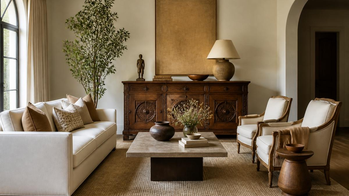
Maintaining this visual equilibrium requires a thoughtful approach to mixing art styles that bridges the gap between historical character and contemporary minimalism.
Here are pairings we see work again and again:
- Modern sofa + antique wood console: clean lines against carved detail
- Glass coffee table + traditional wool rug: light against texture
- Minimalist art + ornate mirror frame: restraint against ornament
The reverse also works. A traditional Chesterfield sofa with a modern acrylic side table reads just as well, as long as the color palette stays disciplined.
Do not mix more than two styles in one room. Adding a third style usually pushes the space past the point where a viewer can identify the design throughline, and the room reads as cluttered rather than curated.
How to Choose a Color Palette for a Room
Choosing a color palette starts with one base neutral covering 60 percent of the space, one secondary tone at 30 percent, and one accent at 10 percent, the 60-30-10 rule designers use to keep mixed rooms calm. But the ratio is only the frame; the real work is deciding which colors go in each slot, and that is where most mixed-style rooms fall apart.
The palette is what makes two different furniture styles feel like they belong together. Without it, even beautiful pieces look borrowed.
Build the Palette in Three Moves
1. Pick the base neutral from something you cannot change. Look at your flooring, largest rug, or wall color, the most permanent surfaces, so the base neutral comes from them rather than fights them.
2. Pull the secondary tone from a mid-size surface. Curtains, a secondary seating piece, or a large wood tone. This is where the second style’s personality enters.
3. Choose the accent last, and choose it small. Accent color lives on pillows, art, ceramics, and one bold piece. Pull it from a piece you already love.
The Undertone Test
Before you commit, hold your swatches together in the room’s actual light at the time of day you use it most.
A quick rule: if two colors share an undertone (both warm, or both cool), they will almost always sit together. If one is warm and one is cool, you need a third color that bridges them, usually a neutral that leans neither way.
Where the Palette Does the Heavy Lifting
The palette is the glue between styles. Two styles with a shared color always look more cohesive than two styles with matching furniture and clashing colors, which is why the palette decision comes before the furniture decision, not after.
Two styles with a shared color will always look more cohesive than two styles with matching furniture and clashing colors. Lock the palette first, then shop.
Decorating Rules for Mixing Patterns, Textures, and Motifs
The decorating rules for mixing patterns are simple: vary the scale, repeat one motif, and keep the palette constant.
Texture is your quietest tool. A room with three patterns but only one texture feels flat. A room with one pattern and four textures feels rich.
Use this scale guide:
- Large-scale pattern: rug or curtains (one only)
- Medium-scale pattern: accent pillows or a throw
- Small-scale pattern: trim, ceramics, or a single decorative object
Repeat one shape or motif across the room. A curved lamp, a curved mirror, and a curved vase read as a family even when the styles differ.
Proportion, Placement, and the Unifying Element
Proportion and placement decide whether a mixed room feels balanced or accidental. The unifying element is the single detail, a color, material, or shape, that appears in every zone.
A few rules worth keeping:
- Anchor the room with one focal point. Art, a fireplace, or a statement piece.
- Keep 18 to 24 inches between a sofa and coffee table. Tight enough to reach, loose enough to walk.
- Hang art so its center sits 57 to 60 inches from the floor. Eye level for most adults.
Visual balance does not mean symmetry. A heavy antique console on one side can be balanced by a lighter modern chair and a tall plant on the other. Weight, not mirroring, is what the eye reads.
Room-by-Room Process and Common Mistakes to Avoid
Most guides stop at principles. The part they skip is the sequence: what to do first, what to do in each room, and what to do when something goes wrong. That sequence is the difference between a room that reads as designed and one that reads as a collection.
The Order of Operations
Work one room at a time and finish it before starting the next. Open-plan homes need extra care: treat each zone as its own room with its own focal point, but keep one shared color and one shared material running through all of them.
The 6-step room process:
- Pick your primary style and secondary style
- Lock your color palette (base, secondary, accent)
- Choose the rug and largest furniture piece first
- Add one statement piece in the secondary style
- Layer texture, pattern, and one repeated motif
- Edit: remove anything that does not share color, scale, or line
Room-by-Room Adjustments
The same six steps apply everywhere, but the emphasis shifts by room.
- Living room: This is where the two styles get the most airtime. Put the primary style on the sofa, rug, and walls, and let the secondary style show up in the accent chair, the coffee table, and the lighting. One focal point only, art, a fireplace, or a statement piece.
- Bedroom: Keep the palette tighter than the living room. The bed is the dominant mass, so the primary style should own the headboard, bedding, and rug. The secondary style belongs on nightstands, lamps, and one textile. Too many patterns here reads as restless rather than layered.
- Kitchen: Styles are hardest to mix here because cabinetry and countertops are fixed. Let the primary style live in the permanent surfaces and bring the secondary style in through hardware, stools, lighting, and open shelving. Swapping cabinet pulls and pendant lights is often the lowest-cost way to shift a kitchen’s style without touching the box.
Common Mistakes and Fixes
| Mistake | Why It Fails | The Fix |
|---|---|---|
| Two styles split 50/50 | No clear leader, room feels mismatched | Shift to 70/30 |
| Three or more styles mixed | No design throughline | Cut back to two styles |
| Matching furniture sets | Feels showroom-flat, no personality | Replace one piece with a contrast piece |
| Clashing color palettes | Visual clutter, no harmony | Rebuild around one base neutral |
| Ignoring proportion | Room feels off, even with good pieces | Check scale and spacing first |
| Buying before planning | Pieces clash when placed together | Plan palette and primary style first |
| Competing focal points | The eye has nowhere to rest | Choose one anchor and subordinate the rest |
| Inconsistent finishes | Metals and woods fight each other | Limit to two metal finishes and two wood tones |
Small Spaces and Budget-Conscious Fixes
For small spaces, keep the palette tighter and lean on texture rather than pattern, fewer colors make a small room read larger, and texture adds interest without visual weight.
If budget is the constraint, the cheapest levers are always the same: repaint, swap hardware, change lighting, and re-cover pillows. Those four moves shift a room’s style without replacing a single large piece.
If you are renovating, buy the rug and the largest furniture piece first. Everything else should be chosen to support those two anchors. This is the single biggest shortcut to a cohesive look.
A measurable cohesion checklist, before you call a room finished:
- One primary style clearly leads the room
- Only two styles are present
- The palette follows 60-30-10
Conclusion
Mixing decor styles cohesively is not about luck or a designer’s eye. It is a repeatable process: one primary style, one secondary style, a disciplined palette, and a single unifying element repeated through the room.
At Verra Luxe Home, our curated collection of premium decor is built for exactly this. Every piece blends artistic elegance with practical functionality, and each is crafted for beauty and durability so it holds up in a real home.
Frequently Asked Questions
What is the 3-5-7 rule in decorating?
The 3-5-7 rule is a guideline for arranging accessories in odd-numbered groupings, such as three candles, five books, or seven small objects on a shelf. Odd numbers create visual movement that even-numbered clusters lack. When you mix decor styles, use the rule to keep small objects from competing: group three pieces in your primary style, then add one or two accents from the secondary style so the shelf reads as intentional rather than cluttered.
How many decor styles can you mix in one room?
Two, occasionally three. One style should dominate at roughly 70 percent of the room, with the second at about 30 percent. A third style only works as a small accent, such as a single lamp or piece of artwork. Adding a third major style usually breaks the cohesive look because no single visual language holds the room together. If you want more variety, vary materials and textures within your two chosen styles instead of adding a third.
How do you keep a room from looking mismatched when mixing styles?
Repeat at least three elements across both styles: a shared color, a repeated material, and a consistent finish. For example, carry a warm brass finish from your modern light fixtures onto a traditional side table, and use the same cream base neutral on walls, upholstery, and curtains. A unifying element like a repeated shape, a common wood tone, or a single area rug gives the eye one thing to follow from piece to piece.
Do you need a designer to mix decor styles cohesively?
No. A mood board, a fixed color palette, and a 70/30 style split handle most of the work. Start with two or three inspiration images that share a mood, pull the colors you see repeated in them, and buy furniture in one dominant style before layering in accents. A curated decor collection with a consistent palette, like the pieces at Verra Luxe Home, removes much of the guesswork because the finishes and tones already coordinate.