
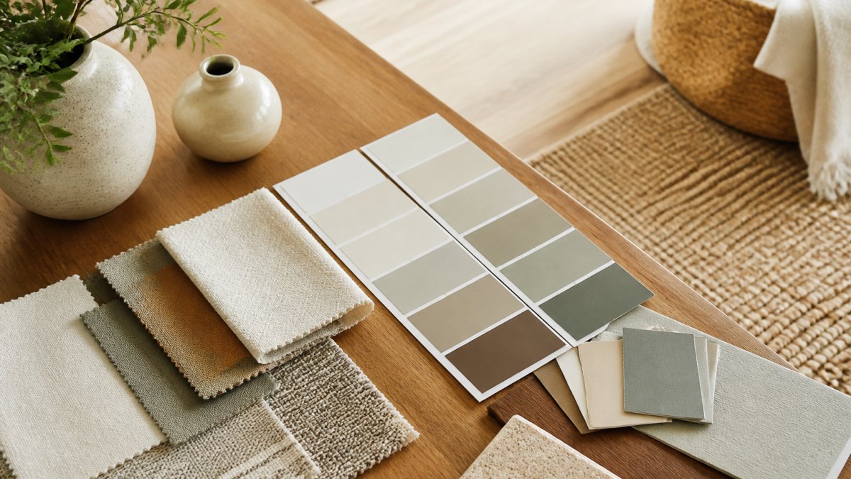
Table of Contents
- Start With a Neutral Base Color
- How to Choose Paint Colors for Your Home
- How Many Colors in a Home Color Palette
- Using Color Palette Tools for Interior Design
- Whole Home Color Palette Examples and Room-by-Room Application
- Create Visual Flow and Repeat Colors Across Rooms
- Common Mistakes to Avoid When Building Your Palette
- Frequently Asked Questions
Last Updated: October 10, 2026
Start With a Neutral Base Color
A neutral base color is the foundation of your cohesive home color palette. This single color should appear on your largest surfaces, typically walls, and set the tone for your entire home. Neutral shades like soft whites, warm grays, beiges, and muted taupes create visual continuity as you move between rooms.
Choose a neutral that leans warm (creamy, soft) or cool (crisp, gray-toned). Walk through your home at different times of day, a color that looks perfect at noon might feel different at dusk.
Your base color doesn’t have to be boring, a warm greige or soft taupe brings sophistication and depth. Consistency is key: when your base color repeats across rooms, your home feels intentional and connected.
Test your base color on at least 12 inches of wall space, not just a paint chip. Large areas reveal how the color actually feels in your room.
How to Choose Paint Colors for Your Home
Your colors must work together to create a whole home color palette that flows naturally from room to room.
Identify your existing fixed finishes: flooring, countertops, wood trim, and hardware. A warm oak floor pairs better with warm neutrals; cool-toned stone counters work with cooler grays.
Test Paint Under Your Actual Lighting
Buy sample sizes of your top three color choices and paint large swatches (at least 2 feet square) on different walls in each room. Check them in morning, afternoon, and evening light. Colors shift dramatically under different lighting conditions, so this testing phase is non-negotiable (How Light & Finish Affect Paint Color).
Account for Existing Finishes and Furnishings
Map out what stays and what changes. If you’re keeping your kitchen cabinets, your paint color must coordinate with them. If your living room sofa is a warm taupe, your wall color should complement rather than fight it. This constraint-based approach prevents costly mistakes and ensures your final palette feels cohesive.
How Many Colors in a Home Color Palette
Most effective home color palettes use three to five distinct colors: one neutral base, one to two accent colors, and optional secondary accents. Your base color covers the largest area (walls in most rooms), while accent colors appear in textiles, artwork, and decor. The sweet spot is a primary neutral, one warm accent, and one cool accent, this creates balance and allows flexibility as you add furnishings.
Using Color Palette Tools for Interior Design
Color palette generators help you explore combinations, but they’re not substitutes for physical testing. Use tools to narrow your choices, then test samples in your actual rooms. Create mood boards by gathering inspiration photos and looking for patterns: Do you gravitate toward warm or cool tones? Muted or saturated colors? Your mood board reveals your instinctive preferences.
Whole Home Color Palette Examples and Room-by-Room Application
Creating a cohesive whole-home color palette requires mapping how colors flow across your entire living space, especially in open-plan layouts, and coordinating with fixed finishes.
Map Your Home by Space Type
Divide your home into three categories: public spaces (living room, dining room, kitchen), private spaces (bedrooms, bathrooms), and transitional spaces (hallways, entryways, stairs). This framework helps you decide where to repeat your base color and where accent colors can shift.
Public spaces should share your neutral base color. Repeating the same neutral base in kitchen, dining area, and living room ties everything together visually and prevents fragmentation. Accent colors can vary room by room.
Private spaces (bedrooms, bathrooms) can introduce different accent colors while maintaining the same neutral base, creating connection despite different personalities.
Transitional spaces (hallways, entryways, stairs) should use your neutral base color exclusively. These spaces connect public and private areas. If your hallway shifts to a different color, it creates a jarring visual break. Keep hallways, stairs, and entryways in your base color to maintain flow.
Coordinate Colors Across Sightlines
In open-plan homes, identify your primary sightlines, the views you see most often. Standing in your kitchen, what colors do you see looking toward the living room? Sitting on your sofa, what colors are visible in the dining area and entryway? These colors should coordinate.
Colors visible at the same time should either:
- Share the same undertone family (all warm or all cool), or
- Contrast intentionally (a warm neutral base with a cool accent color that appears in a specific zone)
Avoid having a warm color family visible in one direction and a cool color family visible in another direction from the same vantage point. This creates visual tension and makes the space feel disjointed.
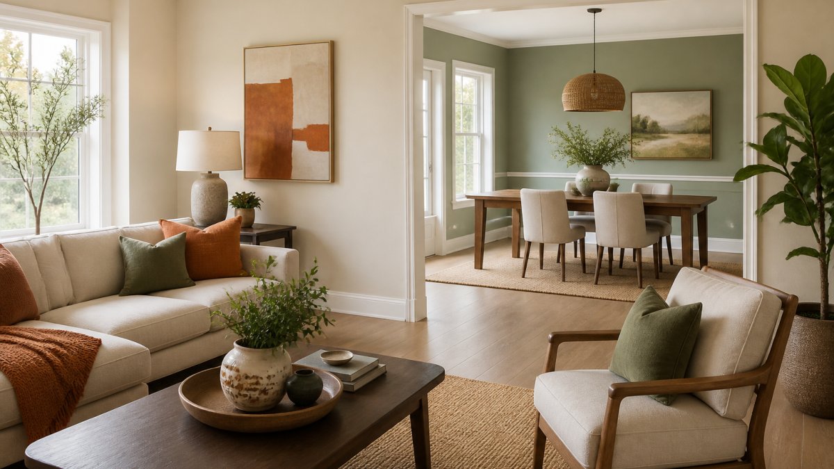
For example, if your living room has a warm gray base with terracotta accents, and your kitchen is visible from the living room sofa, your kitchen should also use the warm gray base. You might add cool blue-gray accents in the kitchen (on cabinetry or backsplash), but the wall color should match the living room to maintain visual continuity.
Work Within Fixed Finish Constraints
Your flooring, cabinetry, countertops, and trim are typically permanent. Build your color palette around these fixed elements rather than against them.
Flooring sets the undertone direction for your entire home. Warm wood flooring (oak, cherry, walnut) pairs better with warm neutrals (warm gray, greige, warm beige).
Cabinetry in kitchens and bathrooms constrains your paint choices in those rooms. If your kitchen cabinets are warm white or natural wood, your walls should lean warm. If cabinets are cool gray or white with blue undertones, your walls should lean cool.
Countertops and backsplash materials add another layer. Warm granite or marble with gold veining pairs with warm paint colors. Cool-toned quartz or white subway tile works with cool or neutral paint.
Trim and doors (if you’re keeping existing wood) influence your palette. Dark wood trim typically has warm undertones and pairs better with warm neutrals. Light or whitewashed trim is more flexible but still benefits from undertone consistency.
Create a fixed-finish inventory: List your flooring color and undertone, cabinetry color and undertone, countertop color and undertone, and trim color and undertone in each room. Then choose paint colors that harmonize with these fixed elements.
Sample Palette Distribution Across a Home
Here’s how a three-color palette (one neutral base, one warm accent, one cool accent) distributes across different room types:
| Space Type | Room | Base Color | Primary Accent | Secondary Accent | Fixed Finish Coordination |
|---|---|---|---|---|---|
| Public | Living Room | Warm gray | Terracotta (textiles, art) | Soft blue (throw pillows) | Warm oak flooring |
| Public | Dining Room | Warm gray | Burnt orange (chair cushions) | Sage green (wall art) | Warm oak flooring (matches living room) |
| Public | Kitchen | Warm gray | Warm wood tones (open shelving) | Pale blue-gray (backsplash accent) | Natural wood cabinetry, warm countertop |
| Transitional | Hallway | Warm gray | None (base only) | None (base only) | Warm oak flooring (connects all spaces) |
| Private | Master Bedroom | Warm gray | Warm taupe (bedding, curtains) | Cool gray-blue (accent wall or artwork) | Warm wood flooring |
| Private | Guest Bedroom | Warm gray | Soft sage (bedding) | Warm cream (curtains) | Warm wood flooring |
| Private | Master Bath | Warm gray | Warm wood tones (vanity) | Cool white tile (shower surround) | Warm vanity, cool tile |
Notice that the warm gray base repeats everywhere, creating continuity. Accent colors shift by room, but they’re distributed so that colors visible from the same sightline coordinate. The warm wood tones appear in both the kitchen and master bath, reinforcing the warm undertone family. Cool accents (blue, sage, white tile) are placed in specific zones where they won’t compete with warm accents in adjacent visible spaces.
Test Your Palette in Open-Plan Spaces
If your home has an open floor plan, paint large swatches of your base color on walls in each connected area. Stand at your primary vantage points (kitchen counter looking toward living room, sofa looking toward entryway) and observe how the color appears across the open space. The base color should feel consistent, even if lighting varies slightly by area.
Then place samples of your accent colors in each room and view them from the main sightline. Accent colors don’t need to match exactly, but they should feel intentional and coordinated, not random.
A cohesive whole-home palette repeats your neutral base across all public and transitional spaces, distributes accent colors by room type, coordinates with fixed finishes, and respects sightlines in open-plan areas. This framework transforms a collection of paint colors into a unified design strategy.
Create Visual Flow and Repeat Colors Across Rooms
Repetition is the secret to a cohesive home color palette. When you repeat colors intentionally, your eye follows them naturally from room to room. This creates visual continuity that feels sophisticated and intentional.
Repeat your base color everywhere. Use the same neutral on walls throughout your home. Then repeat accent colors strategically. If terracotta appears in your living room, bring it back in a throw blanket in your bedroom or artwork in your hallway. This repetition tells your brain that these spaces belong together.
Pay attention to sightlines. In open-plan homes, what colors do you see when standing in your kitchen looking toward the living room? These colors should coordinate. Your eye shouldn’t jolt from one color family to a completely different one.
Repeating colors across rooms, especially your neutral base, creates the visual flow that makes a home feel designed rather than random.
Common Mistakes to Avoid When Building Your Palette
The biggest mistake is choosing colors in isolation. Paint chips look different on your walls than they do in the store. Testing is essential, but many homeowners skip this step and end up with colors that disappoint.
Another common error is ignoring lighting. A color that works in a north-facing room with soft, cool light might feel completely different in a south-facing room with warm, direct sunlight. Account for your room’s actual lighting before committing.
Don’t force colors that don’t coordinate with your existing finishes. If you love a color but it clashes with your flooring or cabinetry, the friction will bother you. Work within your constraints rather than against them.
Finally, avoid too many accent colors. Five different colors competing for attention creates visual noise. Stick to your three-to-five color range and resist the urge to add more. Your palette becomes stronger through restraint, not abundance.
Building a cohesive home color palette transforms your space from a collection of rooms into a unified home. The result is a home that feels intentional, sophisticated, and unmistakably yours. WCAG color contrast guidelines for accessible interior design recommend testing your color combinations for visual comfort. Shop our curated collection of premium decor pieces that coordinate beautifully with any color palette, and create the sanctuary of style you deserve.
Frequently Asked Questions
How many colors should be in a whole-home color palette?
A cohesive home color palette typically uses 3 to 5 main colors: one neutral base, one to two accent colors, and one to two supporting shades. This range prevents the palette from feeling too monotonous while maintaining visual harmony. The base color anchors your scheme (walls, large furniture), accents add personality (artwork, throw pillows), and supporting shades bridge the two. You can repeat these same colors across rooms to create flow.
What’s the best way to test paint colors before committing?
Buy sample pints of your top color choices and paint large swatches (at least 2 feet by 3 feet) on your walls in the actual room. Observe them at different times of day, morning light, afternoon light, and evening artificial light all shift how colors appear. Leave samples up for several days. This reveals whether a color reads too warm, cool, or muddy in your specific space, preventing costly mistakes after full commitment.
How do I make different rooms flow together without using identical paint colors in each?
Use the same color family (warm neutrals, cool grays, or soft earth tones) as your base across rooms, then vary the depth or intensity slightly. Repeat your accent colors through decor, textiles, and artwork rather than paint alone. This creates visual continuity through color repetition while allowing each room its own character. Open-plan spaces benefit most from consistent base tones on connected walls.
Should I choose my color palette based on paint color alone?
No. Your palette must account for flooring, existing furniture, countertops, and other fixed finishes that won’t change. Pull color inspiration from materials you’re keeping, if your kitchen has warm wood cabinets, your palette should lean toward warm undertones. Coordinate paint, textiles, artwork, and decor as one system. This ensures new pieces (like premium decor from Verra Luxe Home) integrate seamlessly with what’s already in place.