Table of Contents
- What You’ll Need to Assess Your Space
- Start with Room Dimensions and Furniture Footprint
- Visual Weight in Interior Design: The 60-30-10 Rule
- Step 1: Establish Your Focal Point
- Step 2: How to Arrange Decor on Shelves
- Step 3: Balance Height and Negative Space
- Decorating Tips for Non Designers: Common Mistakes to Avoid
- Budget-Friendly Scale Adjustments That Work
- Frequently Asked Questions
Last Updated: September 4, 2026
What You’ll Need to Assess Your Space
Decor scale is the relationship between the size of your furnishings and accessories and the room that contains them. Getting it wrong makes a spacious living room feel cluttered or a cozy den feel sparse and unfinished.
Start by measuring the room’s length and width, then note the ceiling height. Walk the perimeter and observe how much floor space your large furniture actually occupies. This furniture footprint, combined with your room dimensions, becomes the reference point for every accessory decision you make.
You will also need a tape measure, painter’s tape for marking wall areas, and a phone camera to photograph your space from multiple angles. Reviewing photos helps you spot proportion issues that your eye misses in person. According to interior design guidance from the American Society of Interior Designers, trained designers consistently evaluate spatial relationships before selecting individual pieces, a habit worth borrowing.
Start with Room Dimensions and Furniture Footprint
The most common scale mistake is buying decor that suits the furniture but ignores the room. A massive sectional sofa in a 10 by 12 foot room leaves almost no negative space, making even correctly sized accessories feel overwhelming.
Here is the exact workflow designers use when planning a room layout:
-
Measure the room’s length and width in feet. Use a laser distance measurer for accuracy; a tape measure works but takes longer. Record the ceiling height as well, since it affects vertical scale decisions later.
-
Calculate the room’s total square footage. Multiply length by width. For example, a 12 x 14 foot room is 168 square feet.
-
Measure each large furniture piece’s footprint. For a sofa, measure the width and depth. For a dining table, measure the full length and width including chairs pushed in. Write these down.
-
Add up the total furniture footprint square footage. Divide this number by the room’s total square footage. This gives you the furniture-to-floor ratio. A common pattern in professional design is to keep this ratio between 30 and 50 percent for living spaces. Below 30 percent, the room feels sparse and decor needs to work harder to fill visual gaps. Above 50 percent, the room feels crowded and you must reduce the size or number of accessories to avoid a cluttered look.
-
Check clearance zones. Measure the walking paths between furniture pieces and walls. The Americans with Disabilities Act (ADA) standards for accessible design recommend at least 36 inches of clear width for main pathways, though in residential settings 30 inches is often workable for secondary paths. For seating arrangements, 18 to 24 inches between the coffee table and sofa is the standard range that allows comfortable legroom without making the table feel disconnected.
Once you have these numbers, you can determine how much visual weight your decor needs to carry. A room with a 40 percent furniture footprint leaves substantial negative space that needs filling with appropriately scaled accessories.
Smaller rooms demand fewer, more purposeful pieces. A single oversized mirror or large-scale art piece often works better than several small framed prints competing for attention. In larger rooms, you may need to group accessories to prevent them from feeling lost.
Write your room’s dimensions and furniture footprint on a sticky note before you shop. When you are considering a decor piece, compare its dimensions against that note rather than relying on memory or in-store context, which always distorts perceived size.
Visual Weight in Interior Design: The 60-30-10 Rule
Visual weight in interior design refers to how much attention an object draws based on its size, color, texture, and placement. Dark colors and large forms carry more weight than light colors and small forms.
The 60-30-10 rule, borrowed from color theory, translates beautifully to decor scale. Apply 60 percent of your visual weight to the dominant furniture pieces, 30 percent to secondary elements like rugs and curtains, and 10 percent to accent accessories. This framework ensures your space feels intentional rather than haphazardly arranged.
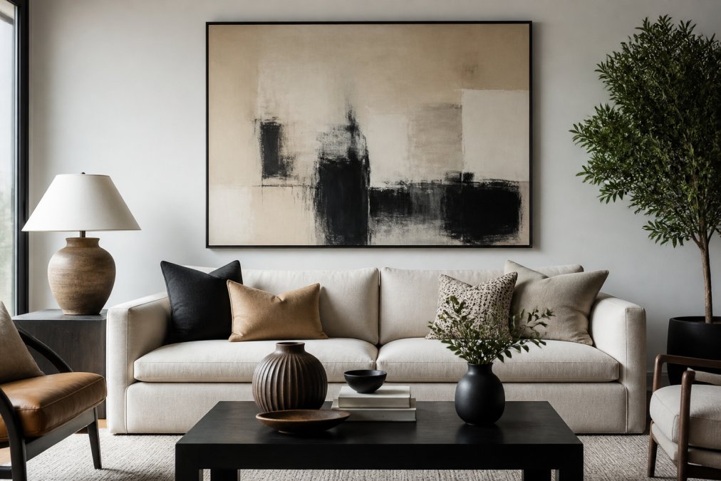
For example, a large neutral sofa represents the 60 percent anchor. A wooden coffee table and floor lamp contribute the 30 percent layer. The remaining 10 percent might be a sculptural vase or a stack of art books on the coffee table.
Photograph your room in black and white to see visual weight clearly. Color disappears, leaving only the tonal mass of each object, which reveals whether your arrangement leans too heavy on one side.
Step 1: Establish Your Focal Point
Every well-scaled room needs a focal point that anchors the eye and gives the rest of the decor a reference for proportion. Start by identifying the architectural feature or largest furniture piece that naturally draws attention.
Arrange your furniture to face or frame this focal point, then select decor that complements rather than competes with it. If your focal point is a dramatic fireplace mantel, choose a mirror or art piece sized to roughly two-thirds of the mantel’s width.
For rooms without an obvious architectural feature, create a focal point using a large furniture piece like an upholstered headboard or a substantial console table. The key is committing to one dominant element rather than allowing several medium-sized pieces to vie for attention.
Step 2: How to Arrange Decor on Shelves
Arranging decor on shelves requires balancing decor scale across multiple horizontal surfaces. Begin by removing everything from the shelves, then group items by height, color, and visual weight.
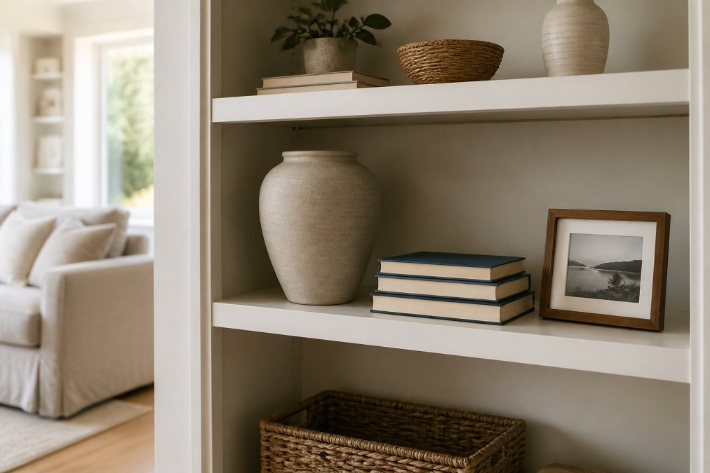
Work in odd numbers, grouping items in threes or fives rather than pairs. Vary the heights within each group so the eye moves naturally: a tall vase beside a stack of books, then a small framed photo leaning at a slight angle. Leave breathing room between groups to prevent the shelf from feeling overcrowded.
The Rule of Three for Shelf Styling
The rule of three is a styling principle that groups objects in odd numbers to create visual interest and natural rhythm. Three items of varying heights, textures, and shapes always look more curated than two matching pieces or a scattered collection.
Combine one tall item, one medium item, and one small item in each group. A candlestick holder, a stack of leather-bound books, and a small ceramic dish form a classic composition that works across design styles.
Avoid lining up items of equal height in a row. This creates a monotonous horizon line that reads as flat and unconsidered, regardless of how beautiful the individual pieces are.
Step 3: Balance Height and Negative Space
Negative space is the empty area around and between your decor, and it is just as important as the objects themselves.
Vary vertical height across the room to create depth and dimension. A floor lamp or tall plant draws the eye upward, while low-profile coffee table decor keeps the visual field grounded. Aim for at least three distinct height levels in any major sightline: low, mid, and tall.
Ceiling height also influences your scale decisions. Rooms with standard 8-foot ceilings feel cramped with oversized tall furniture, while 10-foot ceilings can handle substantial vertical pieces.
Decorating Tips for Non Designers: Common Mistakes to Avoid
Most decorating tips for non designers focus on what to buy, but knowing what to avoid matters just as much.
Here are the five most common scale mistakes, how to diagnose them, and the exact fix for each:
Mistake 1: The floating island effect. When a sofa or chair sits far from walls and other furniture, it creates a visual void around it. This usually happens when the furniture footprint is below 30 percent of the room’s floor area. The fix is not to buy bigger furniture but to pull pieces closer together into defined zones. Move the sofa 12 to 18 inches closer to the coffee table, and add a rug underneath to visually anchor the grouping.
Mistake 2: The museum shelf. Decor items spaced too evenly apart, each with equal breathing room, look like a retail display rather than a lived-in home. This happens when you measure gaps between objects instead of grouping them. The fix is to cluster items into 2 or 3 distinct groups per shelf or surface, leaving larger negative space between groups. Each group should have one tall, one medium, and one small item.
Mistake 3: The one-inch-off problem. A decor piece that is just slightly too small or too large for its surface often reads as an error, even when the buyer cannot articulate why. A lamp that is 2 inches shorter than the sofa arm height, or a wall art piece that is 4 inches narrower than the sofa below it, creates subconscious discomfort. The fix is to use the two-thirds rule: decor items on a surface should occupy roughly two-thirds of that surface’s width. Wall art above a sofa should span 50 to 75 percent of the sofa’s width.
Mistake 4: Pushing all furniture against the walls. This creates a large empty center and makes accessories appear disconnected. It is a common default in rooms under 200 square feet, where homeowners fear losing space. The fix is to pull furniture inward at least 12 inches from the wall to create a conversation zone. Even in small rooms, a sofa placed 6 inches off the wall with a slim console table behind it adds depth without sacrificing usable floor area.
Mistake 5: The eye-level line. When every decor piece sits at the same height, typically 36 to 42 inches, which is standard tabletop height, the room feels flat. This happens when you style surfaces without considering vertical variation. The fix is to introduce at least one tall element (floor lamp, tall plant, or floor-to-ceiling art) and one low element (floor cushion, low-profile planter, or coffee table book stack) in every major sightline.
Finally, resist the urge to fill every surface. Empty tabletops and clear counter space are features, not flaws. When you balance decor scale successfully, the room feels composed with intention, and each piece has room to be appreciated. For guidance on a cohesive arrangement, the National Kitchen and Bath Association’s design principles emphasize that restraint and proportion are hallmarks of professional results.
A quick diagnostic test: photograph your room from the doorway at eye level. If any single object draws your eye away from the focal point for more than two seconds, it is likely off-scale. Remove that object, photograph again, and compare. This before-and-after test reveals scale problems that in-person viewing masks.
Budget-Friendly Scale Adjustments That Work
Correcting scale problems does not require replacing your furniture or investing in expensive decor. Many visual weight issues are solved by repositioning what you already own.
For small items that feel lost, group them into clusters rather than spreading them across the room. Three small frames hung together create the visual weight of one larger piece, and a collection of candles on a tray reads as a single intentional display.
Consider DIY adjustments like painting a thrifted mirror frame or reupholstering an ottoman in a heavier fabric. These changes alter visual weight without changing the furniture footprint. A room’s scale is ultimately about perception, and small shifts in placement, grouping, and color can transform how balanced decor scale feels. Research from the University of Minnesota’s design research archive suggests that spatial perception improves with deliberate practice, so experiment freely and trust your eye as it develops.
Balancing decor scale is a skill that improves with observation and practice, not a talent you are born with. Start with your room dimensions, commit to a focal point, and let the 60-30-10 rule guide your accessory choices. Verra Luxe Home curates a collection of premium decor pieces designed to blend artistic elegance with practical functionality, making it easier to find statement items that anchor a room without overwhelming it. Explore our curated selection and discover pieces that bring harmony to your living space. Get started with Verra Luxe Home and transform your home into a sanctuary of style.
Frequently Asked Questions
What is the 3-5-7 rule in decorating?
The 3-5-7 rule is a guideline for creating visually balanced arrangements using odd numbers. Group items in sets of three, five, or seven, varying their heights and sizes. Odd numbers feel more natural and dynamic than even pairs, which can look stiff. For example, on a coffee table, cluster a tall vase, a stack of two books, and a small sculptural object. The uneven count and varied heights create rhythm and prevent the eye from getting bored.
What is the difference between scale and proportion in design?
Scale refers to how the size of one object relates to the size of the room or the objects around it. Proportion, on the other hand, is the relationship between the parts of a single object or composition. A large sofa in a small room is a scale problem. A sofa with oversized arms and a tiny back is a proportion issue. Both work together to create visual harmony, and fixing one often requires adjusting the other.
How do I mix large and small decor items without losing balance?
Anchor the arrangement with one large item, then build around it with smaller pieces at varying distances. Place the large object off-center to avoid a static look. Use visual weight to balance the composition: a small, dark, or textured item can counterbalance a larger, lighter one. On a mantel, for instance, pair a large mirror with a low, wide bowl on one side and a tall, slim candlestick on the other to create asymmetrical balance.
Why does my room feel cluttered even with minimal decor?
Clutter often comes from poor scale, not too many items. When every piece is a similar size, the eye has no single place to rest, creating visual noise. Introduce a clear focal point, such as a large piece of art or a substantial lamp, and let smaller items support it. Check your negative space: if objects fill every surface, the room will feel cramped. Edit down to pieces that vary in height and visual weight.
This article was written using GrandRanker