Table of Contents
- Start With a Unifying Element
- Decorating Tips for Non-Designers: Master the Fundamentals
- How to Mix and Match Furniture Styles Without Clashing
- Living Room Decor Color Schemes That Coordinate
- Layer Textures and Materials for Visual Harmony
- Use the Rule of Repetition and Contrast
- Budget-Friendly Furniture Hacking for Cohesion
- Small Space Strategies for Matching Decor and Furniture
Last Updated: August 23, 2026
Start With a Unifying Element
Every room needs a visual anchor that ties everything together. This unifying element, a color, texture, material, or design aesthetic, becomes your room’s foundation and makes every subsequent decision easier.
Start with something you already own and love: a vintage rug, wooden bookshelf, or inherited artwork. Extract the dominant visual thread from what you’re keeping, then build outward. This approach saves money and ensures authenticity. The unifying element also prevents decision fatigue by filtering choices: Does this honor the unifying element? If not, skip it.
Start with one existing piece you love, then extract its dominant color, texture, or material. Everything else follows from this single decision, making the entire design process less overwhelming.
Decorating Tips for Non-Designers: Master the Fundamentals
You don’t need a design degree to create a sophisticated home. Decorating is a system, not an art form requiring innate talent. Learn the system, apply it consistently, and your space will look professionally designed.
The Rule of Three and Five
Design relies on rhythm and repetition. The Rule of Three means repeating key elements, a color, texture, material, or shape, exactly three times throughout a room, creating recognition without monotony (asid.org). The Rule of Five applies to larger spaces: repeat your anchor element five times at varying scales and intensities.
If your unifying element is warm wood tones, repeat it through a wooden coffee table, wooden shelving, and wooden picture frames (Rule of Three). In a larger living room, add a wooden accent wall and wooden decorative bowls (Rule of Five). This repetition creates coherence while variation prevents flatness.
Balance Visual Weight and Scale
Visual weight refers to how "heavy" an object feels in a space. A large, dark sofa has significant visual weight; a delicate, light-colored side table has minimal weight. Balance these by distributing substantial elements across the room rather than clustering them on one side.
Scale matters equally. Ensure proportions feel intentional: a tiny accent chair next to an oversized sectional creates discord, while a delicate console table in a room full of chunky pieces feels out of place. Scan your room and ask whether pieces feel like they belong together.
Balance visual weight and scale by distributing substantial pieces across the room and matching furniture proportions to your decor. If one side feels heavier, add a substantial piece to the other. If your furniture is chunky, choose similarly proportioned accessories.
How to Mix and Match Furniture Styles Without Clashing
Sophisticated interiors almost always mix styles. The key isn’t matching; it’s creating harmony through intentional choices.
Choose a Dominant Style Anchor
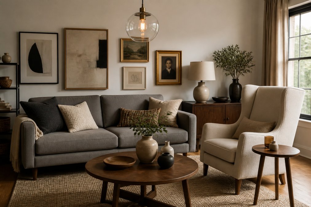
When mixing styles, one must dominate. Choose the style occupying the most visual real estate, typically your largest furniture piece. This becomes your anchor; everything else plays a supporting role.
If your anchor is mid-century modern, your sofa, primary seating, and main storage reflect that aesthetic. Layer in complementary styles strategically: a transitional accent chair, eclectic side table, minimalist floor lamp. The anchor prevents visual chaos and makes mixing styles feel intentional rather than random.
Mid-century modern pairs naturally with minimalism (both value clean lines), and transitional pairs with traditional (both appreciate proportion). These pairings feel natural and require less skill than more dramatic combinations.
Use Complementary Colors and Neutrals
Anchor your palette with neutrals, warm whites, soft grays, warm beiges, soft taupes, which provide the quiet backdrop allowing different styles to coexist. Neutral upholstery on your anchor piece reads as intentional rather than indecisive.
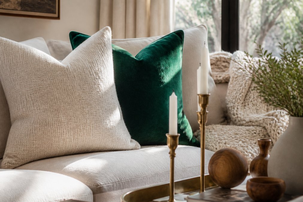
Complementary colors (opposite on the color wheel) create visual interest without clashing. Warm neutrals pair beautifully with jewel tones (deep emerald, sapphire, rich burgundy). Cool neutrals pair with warm accent colors (terracotta, warm mustard, burnt orange). Introduce these through smaller pieces: throw pillows, artwork, decorative objects.
Rooms with multiple furniture styles benefit most from a neutral base palette (60-70% of the room) with 20-30% complementary accent colors and 10% pure accent elements ([asid.org](https://www.asid.org/resources/research)). This ratio creates visual interest while maintaining cohesion.
Living Room Decor Color Schemes That Coordinate
A coordinated color scheme is a system: 60-70% of your room in neutral tones, 20-30% in a primary accent color, and 10% in secondary accents or statement elements.
Your neutral base typically includes your largest furniture pieces: sofa, area rug, primary wall color. These should feel warm and inviting, not sterile. Warm grays, soft whites with warm undertones, natural wood tones, and soft beiges create a sophisticated foundation.
Introduce your primary accent color through medium-scale elements: throw pillows, artwork, window treatments, or an accent chair. If your unifying element is warm wood tones, deep forest green or warm terracotta creates natural harmony.
Secondary accents, metallics, wood finishes, texture elements, add sophistication without overwhelming. A brass floor lamp, wooden decorative boxes, linen throw blankets, ceramic vessels introduce variety while maintaining cohesion.
Mood and Psychology of Color Choice
Color influences how the room feels and affects your mood and energy. Warm neutrals and earth tones create feelings of safety and comfort, slowing the nervous system and encouraging relaxation, ideal for living rooms and bedrooms (apa.org). Cool neutrals and jewel tones feel more energizing, making them excellent for home offices or creative spaces.
Consider the room’s purpose first. A living room where you entertain benefits from welcoming, warm colors. A home office benefits from colors promoting focus. A bedroom benefits from colors encouraging rest.
Saturation matters too. Highly saturated colors energize and demand attention; use them sparingly in small doses. Desaturated colors feel calming and sophisticated, ideal for most of your palette.
Layer Textures and Materials for Visual Harmony
Texture is the secret weapon of sophisticated interiors. A room with varied textures, smooth linen, nubby wool, polished wood, matte ceramic, soft velvet, feels more dynamic and engaging than one where everything is uniform.
Texture creates visual interest without introducing new colors. Your sofa might be smooth linen; layer it with nubby wool throw pillows, a soft cashmere blanket, a polished wood coffee table, a woven jute rug, and ceramic decorative objects. This mix creates visual richness.
Texture also affects how light moves through a room. Smooth, reflective surfaces bounce light and feel brighter. Matte, absorbent surfaces diffuse light and feel warmer and more intimate. Combining both creates balance.
Introduce at least 5-7 different textures in a room through upholstery, rugs, throw pillows, wall treatments, flooring, decorative objects, and window treatments. This variety creates a curated, sophisticated feel.
Use the Rule of Repetition and Contrast
Repetition creates harmony; contrast creates interest. Together, they’re the foundation of visual sophistication.
Repetition means using the same element multiple times throughout the space, creating visual rhythm. When you repeat your unifying element three to five times, you’re applying repetition.
Contrast means introducing elements that differ from your dominant pattern. If your room is mostly soft and round, introduce something angular. If mostly warm, introduce a cool accent. If mostly smooth, introduce something nubby.
The sweet spot is roughly 70% repetition and 30% contrast. Your room should feel cohesive and intentional, with enough variety to stay interesting. When matching decor with furniture, evaluate whether new pieces increase visual interest through contrast or feel random.
Budget-Friendly Furniture Hacking for Cohesion
Premium decor doesn’t require premium prices. Cohesion comes from styling, not price. An affordable side table styled intentionally looks more sophisticated than an expensive one styled carelessly.
Invest in anchor pieces (sofa, primary storage, large area rug) with quality in mind, then hack the accessories. A quality sofa in a neutral tone lasts years; affordable throw pillows, artwork, and decorative objects layered on top create sophistication without premium investment.
Source pieces from different eras and price points, then unify through styling. A vintage side table from a thrift store, paired with an affordable modern lamp and styled with matching decorative objects, reads as intentionally eclectic. The unifying element, perhaps a shared wood tone or color, ties them together.
Verra Luxe Home offers a curated collection of premium pieces designed to serve as sophisticated anchors for your personal style. Layer affordable pieces around Verra Luxe Home’s premium accents, and your room feels cohesive and intentionally designed.
| Budget Strategy | Implementation | Visual Impact |
|---|---|---|
| Invest in anchor, hack accessories | Quality sofa + affordable pillows and art | High-end feel at moderate cost |
| Source across eras | Vintage table + modern lamp + styled objects | Intentionally eclectic, curated |
| Repeat affordable elements | Same pillow color in different fabrics | Cohesion through repetition |
| Strategic thrift sourcing | Quality vintage pieces styled intentionally | Premium aesthetic, thrift pricing |
| DIY styling | Rearrange and restyle existing pieces | Fresh look, zero cost |
Small Space Strategies for Matching Decor and Furniture
Small spaces require intentional design; every piece must earn its place. Choose pieces serving dual purposes: a console table that’s also storage, a coffee table with shelves, ottomans that are both seating and storage.
Choose a single unifying element and commit fully. Rather than five accent colors, choose one. Rather than five textures, choose three. This restraint makes small spaces feel intentional and sophisticated.
Use vertical space: tall, narrow shelving instead of wide, low storage; hang artwork higher; use wall-mounted lighting. This draws the eye upward and makes rooms feel larger.
Light, neutral base colors make small rooms feel airier. A single accent color through artwork, a throw pillow, or decorative object provides interest without overwhelming. Avoid highly saturated colors; choose desaturated, sophisticated tones.
Mirrors are small-space secrets. They reflect light and create depth. A large mirror opposite a window multiplies natural light and makes the room feel significantly larger.
Every piece of decor must be something you genuinely love. This constraint often produces the most intentional, beautiful small spaces because every element has been carefully considered.
Creating a home that feels intentional and sophisticated requires understanding core principles, unifying elements, repetition and contrast, visual weight, color psychology, and applying them consistently. At Verra Luxe Home, we believe your decor should reflect your values and inspire creativity in your everyday life. Our curated collection of premium pieces is designed to serve as the sophisticated anchor for your personal style. Shop Now and discover how thoughtfully crafted decor transforms a house into a sanctuary of style.
Frequently Asked Questions
Q: What is the 3-5-7 rule of decorating, and how does it help match decor with furniture?
A: The 3-5-7 rule guides you to display accessories in groups of three, five, or seven items rather than scattering singles around a room. This creates visual rhythm and balance. When matching decor with furniture, apply this rule to accent pieces, throw pillows, or wall art. For example, group three framed prints above a sofa or arrange five decorative objects on a shelf. Odd numbers feel more intentional and harmonious than even groupings, making your space feel professionally styled rather than random.
Q: How do I choose a color palette that coordinates my existing furniture with new decor pieces?
A: Start by identifying the dominant color in your furniture, typically your sofa or largest piece. Build your color palette around this anchor. Use the 60-30-10 rule: 60% neutral base (walls, large furniture), 30% secondary color (accent pieces, textiles), and 10% accent color (statement decor items). For living room decor color schemes, pull inspiration from one statement piece, a rug, artwork, or throw, and repeat its colors throughout smaller accessories. This creates cohesion without feeling matchy or predictable.
Q: What makes a room look professionally styled versus cluttered when matching decor with furniture?
A: Professional styling relies on intentional spacing, proportion, and visual weight distribution. Avoid overcrowding; leave breathing room on shelves and surfaces. Group similar items (books, candles, decorative objects) rather than scattering them. Ensure decor scale matches furniture scale, large artwork on large walls, appropriately-sized throw pillows on sofas. Use repetition of color, texture, or material across the room to tie pieces together. Clutter happens when items feel random or overwhelming; styling happens when every piece has purpose and placement.
Q: Can I mix modern and traditional furniture styles, and how do I coordinate decor to make it work?
A: Yes, mixing furniture styles creates visual interest when done intentionally. Choose one style as your dominant anchor (e.g., 70% transitional, 30% modern accents). Unify mixed styles through a consistent color palette and repeated materials, if your modern sofa is gray linen, echo that in traditional wooden side tables or neutral artwork. Use decor accessories like throw blankets, pillows, and art to bridge style gaps. Avoid mixing too many competing aesthetics; stick to two or three cohesive styles with shared color families or material finishes.
This article was written using GrandRanker
Leave a Reply