Table of Contents
- Start With a Clear Vision: Building Your Design Foundation
- Interior Design Color Palette Rules That Actually Work
- Master Texture, Scale, and Material Repetition
- How to Mix Furniture Styles Without Creating Visual Chaos
- Decorating Tips for Non-Designers: Practical Strategies
- Create Visual Flow Between Adjacent Rooms
- Bring It All Together: Your Cohesive Design Checklist
- Conclusion
Last Updated: August 27, 2026
Start With a Clear Vision: Building Your Design Foundation
Designing cohesive rooms begins with a single decision: what story do you want your space to tell? Before you buy furniture or select paint colors, you need a vision that anchors every choice. Most people stumble here, falling in love with individual items and ending up with scattered rooms that lack unity.
At Verra Luxe Home, we understand how transformative a clear vision becomes. When you know exactly what you’re building toward, every purchase makes sense.
Define Your Mood Board and Design Theme
A mood board is your north star. Gather images, fabric swatches, paint samples, and photographs of spaces that resonate with you. Look for patterns in your choices. Do you gravitate toward warm wood tones and soft neutrals, or cool grays with metallic accents? Are you drawn to maximalism or minimalism?
Your design theme emerges from these patterns. Perhaps it’s "warm transitional," blending traditional comfort with modern simplicity, or "eclectic bohemian," or "contemporary minimalist." The clarity matters more than the name. When deciding whether to buy a throw pillow, your theme answers instantly: Does this belong?
Create your mood board digitally or physically. Spend time with it for a week or two. Does it still feel right, or do you need to adjust before investing in larger pieces?
Choose Your Neutral Base and Accent Colors
Your neutral base forms 60% of your room: walls, large furniture, flooring. Common bases include warm whites, soft grays, warm beiges, or greige. The undertone matters more than you might think. A warm white with yellow undertones reads differently than a cool white with blue undertones. Test paint samples at different times of day.
Once your neutral base is established, select accent colors for the remaining 10-30% of your palette. A rich navy paired with warm cream, or forest green with soft taupe. Complementary colors (opposite on the color wheel) create vibrant harmony. Analogous colors (adjacent on the wheel) create subtle unity. Repeat your accent colors throughout the room in different forms: wall art, textiles, decorative objects, hardware.
Interior Design Color Palette Rules That Actually Work
Color theory intimidates many people, but the rules are simpler than you’d think.
The 60-30-10 Rule and Beyond
The 60-30-10 rule is the most practical framework for cohesive rooms. Allocate 60% to your dominant neutral color, 30% to a secondary color, and 10% to an accent color (asid.org). This ratio creates visual balance without monotony.
This rule isn’t absolute, it’s a starting point. In smaller apartments, you might shift to 70-20-10. In maximalist spaces, you might invert the ratio entirely. The principle remains: establish hierarchy. Without it, every color competes equally and the room feels overwhelming.
The real power is that it forces intentionality. You can’t use five equally important colors and expect cohesion. You must choose what matters most, what supports it, and what punctuates it.
Complementary Colors and Visual Harmony
Complementary colors sit opposite each other on the color wheel: blue and orange, red and green, yellow and purple. When used together, they create vibrant contrast. The secret: use one as the dominant color and the other as a small accent.
A room painted in warm cream with small pops of navy feels intentional and elegant. A room split evenly between cream and navy feels unresolved. The same principle applies to analogous colors, they naturally harmonize but still need hierarchy to feel designed.
Consider the psychological impact. Warm colors feel energizing and intimate. Cool colors feel calm and spacious. Neutrals feel timeless. Your color choices should reinforce the mood you want the room to evoke.
Master Texture, Scale, and Material Repetition
A room with a cohesive color palette but no textural variety feels flat and lifeless. Texture prevents neutral rooms from becoming boring.
Balancing Scale and Proportion in Furniture
Scale refers to furniture size relative to the room and each other. Proportion refers to visual weight and balance. Your largest furniture piece should occupy roughly one-third of the wall it faces (asid.org). Leave breathing room around major pieces. Furniture floating in the center creates visual flow; furniture pushed against every wall feels cramped.
Consider vertical scale too. In rooms with high ceilings, low furniture feels cavernous. Taller pieces, bookcases, tall lamps, wall-mounted shelving, help anchor the space. In standard eight-foot ceilings, low-profile furniture can feel more intimate and spacious.
Mix scales deliberately. A large sofa paired with delicate side tables, or a substantial dining table surrounded by slender chairs, prevents monotony while maintaining unity through color and material consistency.
Creating Rhythm Through Texture and Finishes
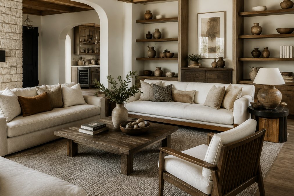
Texture is the tactile quality of surfaces. A room needs a mix: smooth (glass, polished wood, ceramic), rough (linen, raw wood, stone), soft (velvet, wool, faux fur), and hard (metal, concrete). Without variety, the space feels one-dimensional.
Finishes carry equal weight. Matte finishes feel sophisticated and absorb light, creating calm. Glossy finishes reflect light and feel energetic. Mix them deliberately.
Material repetition creates intentional texture. If you use natural wood in flooring, repeat it in furniture and decorative elements. If you introduce woven textiles in your area rug, echo them in wall hangings or throw pillows. This repetition creates rhythm that feels satisfying.
Rough, natural textures feel organic and grounded. Smooth, refined textures feel luxurious and contemporary. A cohesive room usually leans one direction or blends them intentionally.
How to Mix Furniture Styles Without Creating Visual Chaos
The most interesting, livable spaces blend styles thoughtfully rather than committing to a single aesthetic.
Anchor Pieces and Transitional Design
An anchor piece is a substantial, visually dominant item that sets the tone. Often it’s a sofa, dining table, or bed. This piece should reflect your primary design theme. If your anchor is a modern sectional in gray linen, secondary pieces can introduce other styles, a vintage wooden side table, a traditional wingback chair, a contemporary floor lamp, because they’re clearly secondary.
Transitional design bridges different styles. A transitional piece has elements of both traditional and contemporary design: clean lines with warm wood tones and classic proportions. This helps other styles coexist without jarring contrast.
The key is proportion. If 70% of your furniture reads as one style and 30% introduces another, the room feels intentionally eclectic. If you split the difference evenly, it reads as indecisive.
Selecting Consistent Hardware and Architectural Details
Hardware, cabinet pulls, drawer knobs, light switches, doorknobs, is often overlooked but powerfully unifying. When you select hardware in a consistent finish (all brushed gold, all matte black, all polished nickel), it creates subtle continuity. Mixing finishes randomly reads as unfinished.
Architectural details include crown molding, baseboards, window trim, and fixed elements. These should feel cohesive with your overall aesthetic. Modern spaces feature simple, clean trim. Traditional spaces embrace ornate details. When selecting new pieces, consider how their architectural details align with existing fixtures.
Decorating Tips for Non-Designers: Practical Strategies
You don’t need formal training to create spaces that feel intentional and beautiful. You need a framework and permission to trust your instincts.
Using Rugs to Anchor and Connect Spaces
An area rug is one of the most powerful tools for creating visual cohesion. It anchors furniture, defines a space within a larger room, and introduces color, texture, and pattern in a contained way. In open-concept spaces, rugs visually separate different zones.
Size matters enormously. A rug should extend at least 18 inches beyond the furniture it anchors, or ideally, have all four furniture legs on it (asid.org). This creates a cohesive grouping rather than scattered pieces.
Material and pattern introduce design elements safely. A natural fiber rug adds texture and warmth. A patterned rug can introduce your accent colors without requiring you to commit those colors to walls or large furniture.
Rugs also connect adjacent spaces visually. If your living room and dining area are separate but visible from each other, using rugs in the same color family creates visual flow.
The Power of Editing and Decluttering
Sometimes the most important thing you can do is remove things. A room crowded with objects feels chaotic. A room with intentional objects and breathing room feels designed.
Editing means asking hard questions. Does this object serve a purpose, functional or emotional? Does it align with my design theme? Does it complement other objects or compete with them? If the answer is no, remove it.
When you’ve edited ruthlessly, style remaining objects with confidence. Group items in odd numbers (three, five, seven). Vary heights and scales. Create visual weight distribution so one side doesn’t feel heavier than the other.
Create Visual Flow Between Adjacent Rooms
In homes with open floor plans or rooms that open into each other, visual flow becomes critical. A room doesn’t exist in isolation; it’s part of a larger home narrative.
Maintaining Design Continuity Across Transitions
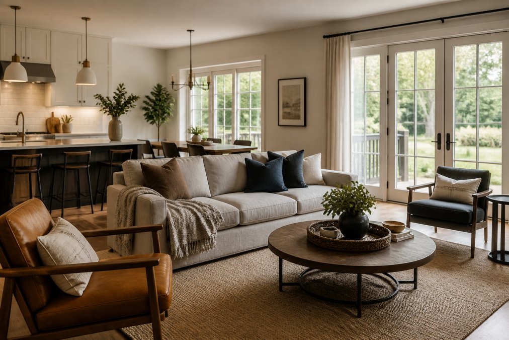
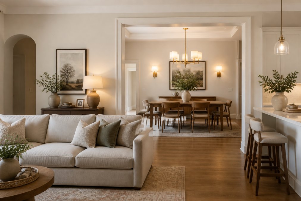
Design continuity doesn’t mean every room is identical. It means there’s a visual thread connecting them. This thread is usually your neutral base color and accent color palette. If your living room is warm cream with navy accents, your adjacent dining room might share these colors while shifting furniture style, scale, or pattern emphasis.
The transition between rooms should feel like a natural progression, not a jarring change. A connecting element, a hallway painted in a transitional color or a rug that bridges both palettes, eases the visual journey.
Consider sight lines. From your living room, what do you see when you look into the adjacent dining area? The colors, styles, and finishes should feel compatible.
Flooring creates powerful continuity. If your living room has hardwood and your dining room has tile, the contrast is jarring. Ideally, use the same flooring throughout, or use complementary materials in a way that feels planned. Area rugs can soften transitions.
Lighting as a Unifying Element
Lighting is one of the most powerful design tools available. Consistent lighting temperature throughout your home creates cohesion. Warm white light (2700K) feels intimate and traditional. Cool white light (4000K) feels contemporary. Mixing them randomly creates visual discord.
Select a lighting temperature and commit to it throughout your home. Then vary fixture styles to match each room’s aesthetic. A traditional chandelier in warm light for a dining room, a contemporary pendant in warm light for a kitchen. The temperature unifies; the fixtures diversify.
Layered lighting, combining ambient (overall room light), task (focused light for activities), and accent (highlighting features), creates depth. A room with only overhead lighting feels flat. Dimmer switches allow you to adjust brightness and mood.
Bring It All Together: Your Cohesive Design Checklist
Before you finalize your space, use this checklist to verify that all elements work together:
| Element | Consideration | Status |
|---|---|---|
| Color Palette | Neutral base, secondary color, accent color clearly defined | ✓ |
| Texture Mix | Smooth, rough, soft, and hard textures represented | ✓ |
| Scale & Proportion | Furniture sized appropriately to room; visual balance achieved | ✓ |
| Material Repetition | Key materials repeated throughout (wood tones, metals, textiles) | ✓ |
| Anchor Piece | Dominant furniture piece establishes primary aesthetic | ✓ |
| Hardware Consistency | Cabinet, door, and fixture hardware in coordinated finish | ✓ |
| Rugs | Appropriately sized; color and pattern support overall theme | ✓ |
| Lighting | Consistent temperature; layered for function and ambiance | ✓ |
| Editing | Unnecessary objects removed; intentional styling evident | ✓ |
| Flow | Adjacent spaces feel visually connected, not disjointed | ✓ |
Walk through your space. Does it feel cohesive? Can you identify your design theme? If you’re hesitating on any element, return to your mood board.
Designing cohesive rooms is ultimately about creating an environment that reflects who you are while feeling intentional and beautiful. The framework matters, color theory, scale, texture, editing, but the real work is making choices that reinforce a unified vision. At Verra Luxe Home, we understand that every piece you choose should feel like it was meant to be there. Our curated collection of premium decor is designed to work together, to create spaces that feel both sophisticated and genuinely yours. Shop Now and start building the cohesive rooms you’ve envisioned.
Frequently Asked Questions
Q: What is the 60-30-10 rule for decorating, and how do I apply it?
A: The 60-30-10 rule is a foundational color formula for designing cohesive rooms. Use 60% of a neutral base color (walls, large furniture), 30% of a secondary color (accent walls, larger pieces), and 10% of a bold accent color (accessories, art, pillows). This proportional approach prevents your space from feeling chaotic while maintaining visual interest and balance throughout the room.
Q: How can I make my home look cohesive without buying matching furniture sets?
A: Cohesion comes from repetition and intentional choices, not matching sets. Select a unified color palette and repeat it across rooms through textiles, wall color, and accents. Choose furniture pieces that share design elements, similar wood tones, leg styles, or upholstery textures. Use consistent finishes and hardware throughout. Anchor each room with one or two statement pieces and layer complementary items around them. This curated approach creates a more sophisticated, intentional aesthetic than matching suites.
Q: What role does lighting play in creating a cohesive design?
A: Lighting temperature and style significantly unify spaces. Use consistent lighting temperatures (warm or cool) across all rooms to maintain visual continuity. Select fixtures that echo your design theme, if you choose modern pendant lights in one room, carry that style into adjacent spaces. Layered lighting (ambient, task, accent) applied consistently creates professional flow and ties your color palette together, as lighting directly affects how colors appear throughout your home.
Q: How do I balance texture to create a professional, cohesive look?
A: Balance texture through repetition and variety. Introduce 3-4 primary textures (wood, metal, fabric, ceramic) and repeat them across rooms in different forms. For example, if you use natural wood in a dining table, echo it in bedroom furniture or shelving. Layer soft textures (rugs, upholstery, throws) with hard surfaces (glass, metal, stone) in proportional amounts. This creates visual interest while maintaining the unified design theme your space needs.
Q: What is the 3-5-7 rule in interior design for cohesive spaces?
A: The 3-5-7 rule guides grouping and layering. Display decorative objects in odd-numbered groups (3, 5, or 7 items) rather than even numbers, this creates more natural, visually appealing arrangements. Apply this to shelving, tabletops, and wall galleries. The principle works because odd numbers feel less staged and more intentional, supporting the curated aesthetic essential to cohesive design.
Q: How do I create visual flow between rooms with different styles?
A: Establish a consistent color palette and repeat it across transitions. Choose anchor pieces, furniture or art, that appear in multiple rooms to create visual bridges. Use transitional spaces (hallways, entryways) to gradually shift between distinct styles rather than jarring contrasts. Maintain consistent lighting temperature and flooring materials when possible. Repetition of materials, finishes, and textile styles ties different aesthetic approaches into one cohesive whole.
This article was written using GrandRanker
Leave a Reply