Table of Contents
- Why Matching Furniture Sets Create Design Problems
- Understanding Undertones and Color Palettes
- How to Mix Furniture Styles Without Creating Clutter
- Decorating Tips for Non-Designers: Scale, Proportion, and Balance
- How to Use the 60-30-10 Rule for Eclectic Style
- Breaking Up Matching Sets: Practical Steps and Budget Hacks
- Creating Visual Interest Through Texture Layering and Contrast
- Conclusion
Last Updated: August 19, 2026
Why Matching Furniture Sets Create Design Problems
Matching furniture sets feel safe but read as sterile. When every piece matches perfectly, your room loses personality and feels like a showroom rather than a lived-in space. Rooms with visual interest, where pieces have different origins, finishes, and silhouettes, feel more sophisticated and tell a story about intentional design choices.
Matching sets also limit flexibility. Once you commit to a coordinated collection, you’re locked into that aesthetic. Refreshing the room in five years means replacing everything. Eclectic style lets you swap individual pieces without disrupting the entire design scheme.
The rooms that photograph best and feel most expensive aren’t the ones where everything matches. They’re the ones where the designer has clearly made intentional choices about scale, proportion, color undertones, and material mixing.
Understanding Undertones and Color Palettes
Before avoiding matchy matchy decor, you need to understand undertones, the subtle colors hiding beneath the surface of a paint color, fabric, or finish. A gray might have warm undertones (leaning toward beige) or cool undertones (leaning toward blue). This distinction matters far more than the surface color itself.
When you mix furniture with different undertones, they clash visually even if they’re technically the same color family. A warm gray sofa paired with cool gray accent chairs will feel jarring. Understanding undertones lets you mix confidently.
Identify the undertones in your existing pieces by examining them in natural light. Does your sofa lean warm (peachy, golden, beige) or cool (blue, gray, silver)? Once you know this, introduce new pieces that complement or intentionally contrast with those undertones. Warm wood tones pair beautifully with warm undertones; cool metal finishes work with cool undertones. You can also use undertone contrast as a design tool, pairing warm and cool elements creates dynamic visual interest when done deliberately.
Choose 3-4 dominant colors that will appear throughout your room, then add 1-2 accent colors for pop. This framework keeps your space cohesive while allowing variety.
The most important design decision isn’t picking matching pieces, it’s understanding the undertones and color relationships between the pieces you choose. Undertones determine harmony far more than surface colors do.
How to Mix Furniture Styles Without Creating Clutter
Mixing furniture styles successfully requires intentionality. The difference between eclectic and chaotic is that eclectic has a logic behind it.
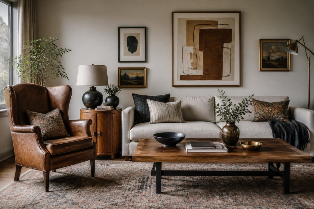
Start with an anchor piece, typically your largest furniture item like a sofa, bed, or dining table. This sets the tone for everything else. If your anchor is modern and minimal, add vintage accent pieces for contrast. If your anchor is ornate and traditional, contemporary pieces provide visual relief.
Introduce pieces with different silhouettes and proportions. If your sofa is low and horizontal, pair it with a tall bookcase. If your dining chairs are delicate and tapered, add a table with chunky legs. This variation prevents monotony.
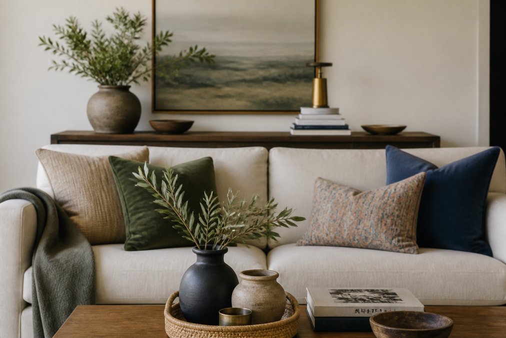
Material mixing is essential for avoiding matchy matchy decor. Combine wood with metal, upholstered pieces with leather, natural fibers with polished surfaces. A room using only one material feels flat; layered materials feel dimensional and sophisticated. Wood tones don’t need to match, mixing warm wood with cool wood creates depth.
Think about creating visual pathways rather than perfect coordination. Your eye should move through the room, landing on focal points. A statement chair draws attention. A gallery wall anchors a space. An accent table becomes a moment of visual interest. These focal points make the overall composition feel intentional.
Decorating Tips for Non-Designers: Scale, Proportion, and Balance
Scale is the size of objects relative to each other and to the room. Proportion is the relationship between different dimensions of a single object.
A common mistake is filling a large room with small furniture, pieces get lost and the room feels empty. Conversely, oversized furniture in a small room feels cramped. Match furniture scale to your room size.
Balance doesn’t mean symmetry. Asymmetrical balance feels more natural and sophisticated. You might have a substantial bookcase on one side balanced by large artwork and a statement chair on the other. Visual weight feels even though nothing matches.
Divide your room into zones, each with a focal point. In a bedroom, the focal point is typically the bed. In a living room, it might be a fireplace or window. Everything else in that zone should support the focal point without competing for attention. This prevents clutter by creating clear visual hierarchy.
When selecting new pieces, hold them against existing furniture to check proportional balance, not matching. A delicate side table next to a substantial sofa looks unbalanced. You’re aiming for visual equilibrium.
How to Use the 60-30-10 Rule for Eclectic Style
The 60-30-10 rule is a practical framework for avoiding matchy matchy decor while maintaining cohesion: 60 percent of your room should be your dominant color, 30 percent your secondary color, and 10 percent your accent color.
Your dominant color is typically your largest furniture piece or wall color. Your secondary color (30 percent) might be your rug, curtains, or accent wall. Your accent color (10 percent) is the pop, throw pillows, artwork, or decorative objects that bring energy.
This rule works because it creates visual balance while preventing chaos. The 60 percent grounds the space. The 30 percent adds interest. The 10 percent is your personality.
When applying this rule to avoid matchy matchy decor, think about material mixing and undertone coordination. Your 60 percent might be warm wood furniture. Your 30 percent could be cool metal accents and gray upholstery. Your 10 percent introduces your favorite accent color in pillows or artwork. The rule keeps these elements from clashing through proportional distribution.
Homeowners who feel intimidated by design decisions but want their space to feel intentional and sophisticated. The 60-30-10 rule removes guesswork and gives you a clear decision-making framework.
Breaking Up Matching Sets: Practical Steps and Budget Hacks
If you already have matching furniture sets, you don’t need to replace everything. Strategic interventions can transform a room from matchy matchy to intentionally eclectic.
Step 1: Re-upholster one piece. Pick one chair or the sofa and give it new fabric. This immediately breaks visual uniformity. Choose a fabric that complements your undertones but offers visual interest.
Step 2: Introduce a contrasting accent chair. Add a chair in a different style, color, or material. A vintage wingback chair next to a modern sofa creates visual interest through opposition.
Step 3: Layer in different wood tones. Introduce pieces with different wood finishes. A walnut side table next to an oak bookcase next to a whitewashed console creates depth.
Step 4: Add a statement rug. A rug with pattern or bold color anchors the space and breaks up visual monotony.
Step 5: Use textiles strategically. Throw pillows, blankets, and curtains are the most budget-friendly way to introduce pattern, color, and texture. Mix different patterns and colors on your sofa.
Budget hack: Shop vintage and secondhand. Vintage pieces have character that new furniture can’t replicate and cost significantly less. A vintage credenza paired with modern shelving creates instant visual interest.
Budget hack: DIY finishing touches. Paint existing pieces a new color or refinish wood furniture. These small interventions completely transform how a piece reads in your space.
Budget hack: Strategic replacement. Replace one piece at a time as your budget allows. This gradual approach lets you build an intentional aesthetic over time.
Creating Visual Interest Through Texture Layering and Contrast
Texture is where rooms come alive. A room with only smooth surfaces feels cold; a room with only soft surfaces feels flat. Magic happens when you layer different textures and create contrast.
Think about materials in your room: wood, metal, fabric, ceramic, glass, natural fiber. Each has different visual and tactile qualities. Wood feels warm and organic. Metal feels cool and refined. Linen feels casual. Velvet feels luxurious. Combining these materials intentionally creates depth and sophistication.
A sofa in linen next to a chair in leather next to an ottoman in wool creates textural variety. Add a jute rug, metal side tables, and ceramic accessories, and you’ve created a room with real dimension.
Contrast is equally important. Smooth surfaces next to rough surfaces. Shiny finishes next to matte finishes. A polished marble side table next to a chunky wooden console creates contrast through material and finish.
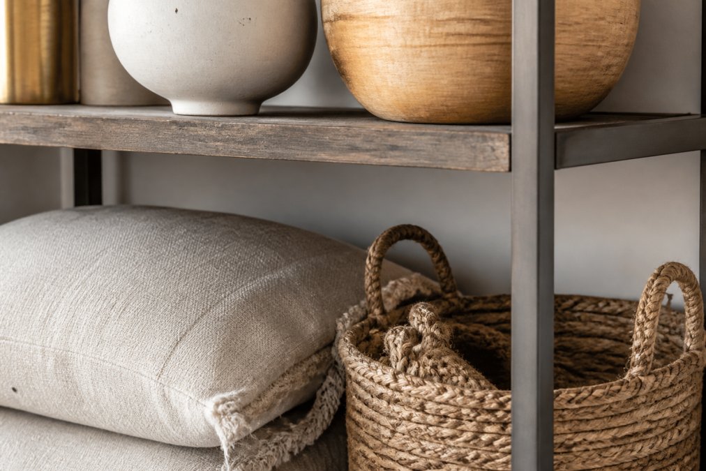
Balance texture by repeating each texture in at least two places. If you have a linen sofa, add linen curtains or pillows elsewhere. This repetition creates cohesion while introducing variety.
Material mixing also introduces undertone variety without discord. Warm wood tones pair naturally with warm metals like brass and copper. Cool wood tones work with cool metals like chrome. Mixed-material pieces can serve as visual transitions between pieces with different undertones.
The rooms that feel most expensive and intentional aren’t the ones where everything matches. They’re the rooms where someone has made deliberate choices about how pieces relate to each other through scale, proportion, undertone, texture, and contrast.
At Verra Luxe Home, we work with homeowners who understand that sophisticated design comes from thoughtful curation, not coordinated sets. Our collection of premium decor pieces is specifically selected to work together while maintaining individual character. When you’re building a room that feels collected rather than purchased, you’re investing in pieces that will work with your evolving style for years to come.
Start with one intentional choice, a piece that breaks the pattern, a texture that adds dimension, a color that brings personality. From there, build outward. Your room will feel more like yours and far more sophisticated than any matching set ever could.
Frequently Asked Questions
What is the 60-30-10 rule in decorating?
The 60-30-10 rule is a design formula for creating balanced, cohesive interiors. Allocate 60% of your space to a dominant color or style, 30% to a secondary color or complementary design element, and 10% to accent pieces or unexpected pops of contrast. This framework prevents rooms from feeling matchy or overwhelming while maintaining visual harmony and allowing eclectic style choices to feel intentional rather than chaotic.
How do you make mismatched furniture look intentional?
Mismatched furniture reads as intentional when it shares common threads: similar undertones, complementary wood tones, or coordinated color palettes. Use texture layering to tie pieces together, a vintage chair next to a modern sofa feels curated when both have compatible material finishes. Anchor the room with a focal point accent piece, and ensure scale and proportion are balanced across the space. Mixing old and new pieces deliberately signals design confidence.
What are the common signs of a matchy-matchy room?
Matchy-matchy decor typically shows no visual interest, variety in wood tones, or textural depth. Signs include all furniture from one set, uniform fabric finishes, a single dominant color with no contrast, identical side tables, matching lamps, and pieces that feel like they came from one store on the same day. These rooms lack personality and spatial planning intentionality. Breaking up matching sets with accent pieces and varied materials creates a curated look that feels more sophisticated.
Can I break up a matching furniture set on a budget?
Yes. Start by removing one or two pieces from the set and replacing them with vintage or secondhand finds that share similar undertones or wood tones. Re-upholster a matching chair in a complementary fabric to introduce texture and visual interest. Layer in affordable accent pieces like throw pillows, rugs, or wall art that add contrast without major investment. Shop thrift stores for unique pieces that balance scale and proportion with your existing furniture, creating an eclectic style that feels intentional and cost-effective.
This article was written using GrandRanker

Leave a Reply