
Table of Contents
- 1. Color Contrast: Pairing Complementary Colors and Warm vs Cool Tones
- 2. Texture Contrast: Mixing Sleek Finishes and Rough Surfaces
- 3. Form and Shape: Balancing Geometric Shapes and Organic Forms
- 4. How to Add Contrast to a Neutral Living Room
- 5. Lighting Design: Using Ambient Light and Shadows to Create Depth
- 6. Pattern Mixing and Negative Space: Contrast Through What You Don’t See
- Decorating Tips for Non Designers: Making Contrast Work in Your Space
- Conclusion
- Frequently Asked Questions
Last Updated: September 26, 2026
1. Color Contrast: Pairing Complementary Colors and Warm vs Cool Tones
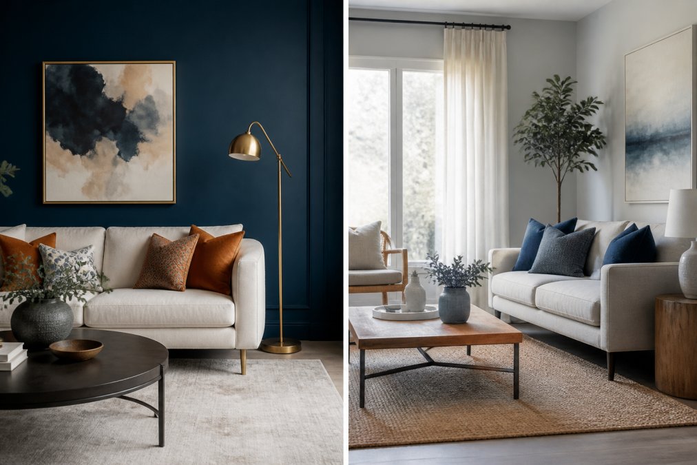
The fastest way to add contrast in interior design is through color, and the most reliable method pairs shades sitting opposite each other on the color wheel. Complementary colors like navy and rust, or forest green and blush, create immediate visual tension that draws the eye and gives a room a clear focal point.
Warm versus cool tones work on the same principle. A cool gray wall paired with warm cognac leather creates depth without a single pattern in the room. According to color theory guidance from the Smithsonian’s Cooper Hewitt Design Museum, complementary pairings read as more vibrant precisely because the eye processes them as opposites.
High Contrast vs Subtle Contrast: Choosing Your Intensity
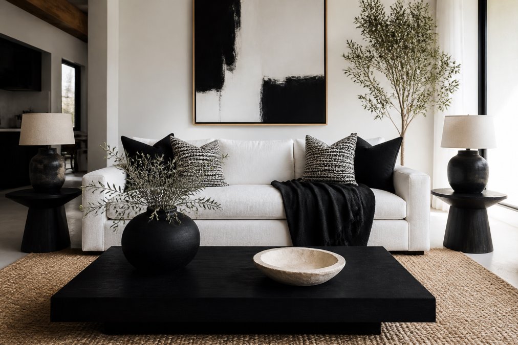
High contrast uses strong opposites: black and white, deep teal and cream, charcoal and brass. It reads as bold and modern, but it can overwhelm a small room fast.
Subtle contrast softens the gap between shades. Think oatmeal and warm taupe, or slate blue and dove gray. This approach suits bedrooms and spaces where you want visual harmony rather than drama.
A practical rule: match your contrast level to the room’s purpose. High contrast for entryways and living rooms where you want energy. Subtle contrast for rest spaces.
2. Texture Contrast: Mixing Sleek Finishes and Rough Surfaces
Texture is the contrast tool most people forget, and it is the one that makes a room feel finished rather than flat. A glossy lacquer console against a rough linen sofa creates tactile quality that photographs beautifully and feels rich in person.
The pairing works because your eye registers two different surfaces at once. Sleek finishes reflect light; rough surfaces absorb it. That difference alone creates dimension without adding color or pattern.
Try these combinations:
- Polished marble countertops with raw oak shelving
- Velvet cushions on a woven jute rug
- Smooth ceramic vases beside a chunky knit throw
- Brushed metal fixtures against matte plaster walls
Layer at least three textures in any room you want to feel complete. Two textures read as accidental; three or more read as intentional design.
3. Form and Shape: Balancing Geometric Shapes and Organic Forms
Geometric shapes and organic forms are the quiet workhorses of contrast in interior design. A rectangular coffee table against a round mirror, or a curved sofa in a room full of straight lines, gives the eye somewhere to rest and something to notice.
Straight lines feel structured and modern. Curves feel relaxed and welcoming. Rooms that lean entirely one way often feel either stiff or shapeless.
The balance matters more than the individual pieces. If your furniture is all hard-edged, add a rounded lamp or an arched floor mirror. If everything curves, introduce a square side table or a linear bookshelf. Proportion and scale should guide the mix, not symmetry.
4. How to Add Contrast to a Neutral Living Room
Adding contrast to a neutral living room does not require repainting or replacing furniture. You can create visual interest through accessories, texture, and strategic placement of darker or lighter elements.
Start with what you already have. A beige sofa on a beige rug is not a design failure; it is a blank canvas. Here is how to build contrast without abandoning the calm palette:
- Add one dark anchor piece. A charcoal floor lamp or a black-framed mirror gives the eye a starting point.
- Introduce rough texture. A chunky wool throw or a jute rug breaks up the smoothness.
- Layer in metal. Brass, bronze, or matte black hardware adds a reflective surface.
- Use negative space deliberately. Do not fill every surface. Empty wall space makes the pieces you do have read stronger.
- Vary height and scale. A tall floor vase next to a low bowl creates vertical contrast.
A single sculptural accent, chosen well, does more for a neutral room than a dozen small additions.
5. Lighting Design: Using Ambient Light and Shadows to Create Depth
Lighting design is contrast you can switch on and off. Ambient light fills a room evenly; directional light creates shadows, and shadows are what give a space depth.
Most rooms fail here because they rely on a single overhead fixture. That flattens everything. Instead, layer three sources: overhead ambient light, task lighting from lamps, and accent lighting that grazes a wall or highlights a piece of art.
Warm vs cool tones matter in lighting too. Warm bulbs around 2700K feel cozy; cooler bulbs around 4000K feel crisp and modern. Mixing them in one room usually looks like a mistake, so pick a temperature and stay with it.
Placing a lamp directly against a wall kills the shadow play that creates depth. Pull furniture and light sources away from walls by at least a few inches to let shadows form.
6. Pattern Mixing and Negative Space: Contrast Through What You Don’t See
Pattern mixing works when the patterns share a color but differ in scale. A large floral cushion beside a small geometric throw reads as intentional; two same-scale patterns fight each other.
Negative space is the other half of this equation. Empty space is not wasted space. A gallery wall with breathing room between frames reads as more sophisticated than one packed edge to edge.
Keep pattern mixing to two or three prints per room, and vary the scale between them. Stripes with florals, geometrics with organic motifs. Then let the walls stay quiet.
Decorating Tips for Non Designers: Making Contrast Work in Your Space
If you are not a designer, the safest path to contrast in interior design is a simple rule: pick one contrast type per room and commit to it. Color, texture, form, or pattern. Trying to do all four at once is the most common mistake.
Here are the practical moves that consistently work:
- Follow the 60-30-10 rule. Sixty percent dominant tone, thirty percent secondary, ten percent accent. The accent is where your contrast lives.
- Test before you commit. Free tools like the Sherwin-Williams ColorSnap Visualizer let you preview color pairings on your own walls.
- Build a mood board first. Seeing pieces together before you buy prevents the clash problem that plagues online decor shopping.
- Buy fewer, better pieces. One strong accent piece outperforms five weak ones every time.
- Check durability against your real life. Homes with kids and pets need materials that hold up, not just look good in photos.
Contrast is not about doing more. It is about choosing one deliberate opposite and letting everything else support it.
Conclusion
The hardest part of contrast is restraint. Most rooms fail because too many competing elements cancel each other out, leaving a space that feels busy rather than designed.
Verra Luxe Home offers a sophisticated and inspiring collection of premium decor, thoughtfully curated to transform your living space into a sanctuary of style. Our commitment to high-quality, durable decor ensures each item not only delights the eye but also reflects your unique values and inspires creativity. Start with one room, one contrast type, and one anchor piece.
Get started with Verra Luxe Home and build a space that reflects your taste without the guesswork.
Frequently Asked Questions
Can you give me some examples of contrast in interior design?
Common examples include a dark sofa against light walls, a glossy metal coffee table beside a rough wooden console, or a large abstract painting on a bare white wall. In each case, two opposing visual qualities sit side by side, and the difference draws the eye. You can also contrast warm and cool tones, such as amber lighting fixtures against blue-gray cabinetry, to create a focal point without adding more objects.
How do you balance contrast without making a room feel chaotic?
Pick one dominant contrast strategy per room and let the rest stay quiet. If you use bold complementary colors, keep textures and patterns subtle. If you mix many materials, keep the palette monochromatic. A useful guideline is the 3-5-7 rule: roughly 60% of the room in one tone, 30% in a mid-tone, and 10% in a high-contrast accent. That ratio keeps visual weight balanced so contrast reads as intentional, not accidental.
How can I use contrast in a neutral color palette?
Neutral rooms rely on texture, form, and lighting contrast instead of color. Try a chunky knit throw on a smooth linen sofa, a round mirror above a rectangular console, or a matte ceramic vase beside a polished metal tray. Layering these differences creates visual interest while keeping the calm, monochromatic feel. Even small shifts in tone, like warm ivory against cool gray, add dimension without breaking the neutral scheme.
What is the role of texture in creating visual contrast?
Texture adds tactile quality and depth that flat color alone cannot achieve. Rough surfaces like raw wood or boucle absorb light and feel grounding, while sleek finishes like glass or polished brass reflect it and feel lighter. Pairing the two in one vignette, such as a velvet armchair with a stone side table, gives the eye something to explore and makes a room feel layered and intentional rather than showroom-flat.
What common mistake should I avoid when adding contrast?
The most common mistake is using too many competing contrasts at once. A room with bold color blocking, mixed patterns, and clashing materials can feel visually chaotic and hard to rest in. Choose one or two contrast levers, such as color and lighting, and let the rest of the room support them. This keeps the space feeling sophisticated and cohesive instead of busy, which matters especially in open-plan layouts.