
Table of Contents
- Start With a Room-by-Room Cohesion Plan
- Build a Cohesive Color Scheme for a Room
- How to Mix Patterns in a Room Without Visual Chaos
- Room Decor Layout Ideas That Create Visual Flow
- How to Balance a Room With Furniture and Accents
- Common Cohesion Mistakes and How to Fix Them
- Conclusion: Your Cohesive Room Decor Starts With One Decision
- Frequently Asked Questions
Last Updated: October 6, 2026
Start With a Room-by-Room Cohesion Plan
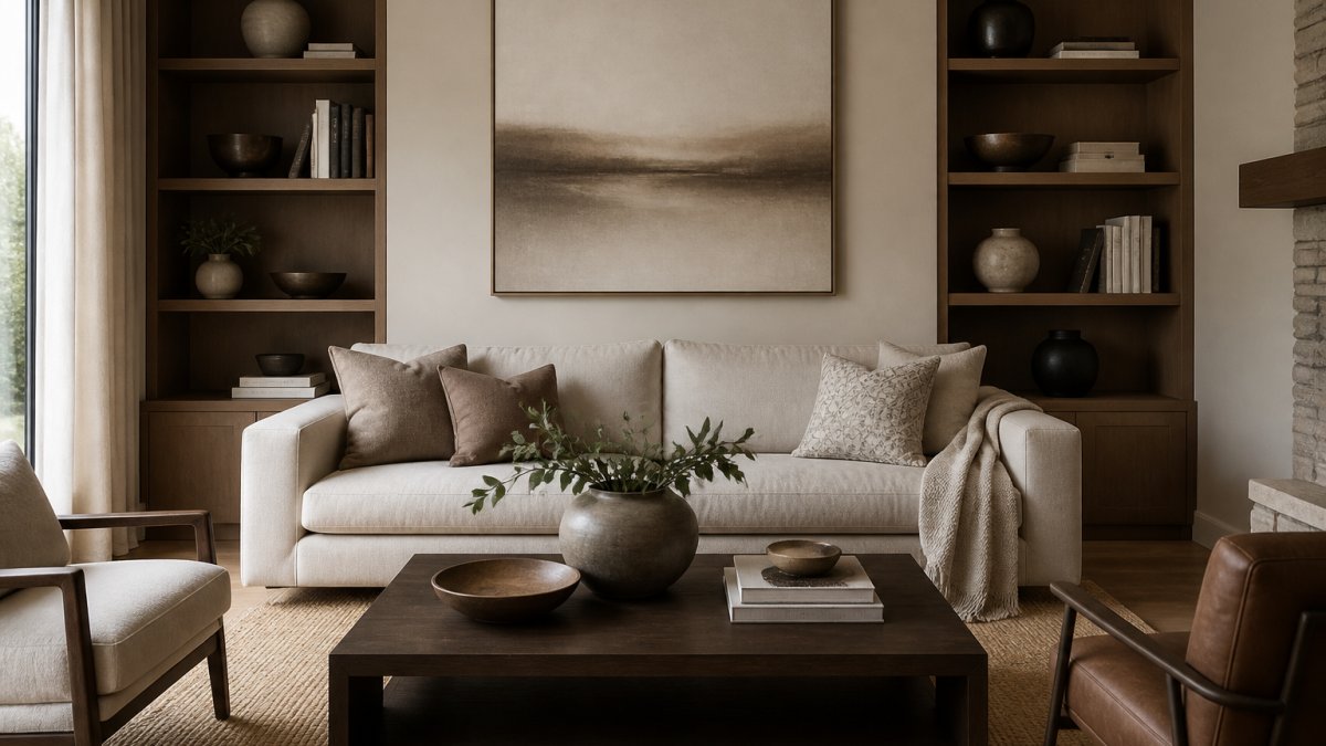
Learning how to create cohesive room decor starts with a plan, not a shopping cart. Cohesive room decor is the practice of tying every space together through shared colors, repeated materials, and consistent style choices so your whole home feels intentional. Extending this logic beyond the threshold of your interior allows you to harmonize your patio or deck into a cohesive outdoor living space that mirrors the aesthetic rhythm established within your home.
That definition matters because most people decorate one room at a time and wonder why the house feels disjointed. Beautiful individual pieces can fight each other once they share a wall.
Below, we’ll show you exactly how to build a plan room by room, starting with what you already own.
Audit What You Already Own Before Buying Anything
Walk through your home with a notepad and list every piece you love. Note its color, material, and scale.
- Photograph each room from two angles
- Mark pieces you’d keep, move, or remove
- Group items by color family
A common mistake is buying new decor before knowing what you have. You end up with duplicates and pieces that never quite fit.
Build a Cohesive Color Scheme for a Room
The fastest route to a cohesive color scheme for a room is choosing one base color, one secondary color, and one accent. Everything else supports those three.
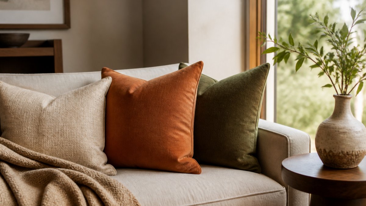
Start with your largest surfaces: walls, floors, and big furniture. These set the base. Then pick a secondary color for curtains, rugs, or an upholstered chair. Save your boldest shade for accents you can swap out easily.
Pull a Palette From Something You Can’t Change
Most guides tell you to pick a color you love. That advice fails the moment you have oak floors, a granite countertop, or a brick fireplace you aren’t replacing. Instead, pull your palette from the fixed elements already in the room.
Here’s the sequence:
- Identify the one surface you cannot change, flooring, countertop, tile, or a built-in.
- Pull three colors out of it: a light neutral, a mid-tone, and a dark tone.
- Assign the light neutral to walls, the mid-tone to secondary pieces, and the dark tone to accents.
- Add one saturated color only if the fixed surface can support it.
This is why a warm gray wall can look muddy next to cool gray tile but clean next to warm oak. The wall color isn’t the problem, the undertone relationship is.
Read Undertones Before You Commit
Every neutral has an undertone: warm (yellow, red, orange) or cool (blue, green, gray). Mixing undertones in the same room is the single most common reason a palette feels off even when the colors technically match.
A practical test: hold a white sheet of paper against the surface, then hold your paint swatch next to it. If the swatch looks pink or yellow against the paper, it’s warm. If it looks blue or green, it’s cool. Keep every neutral in the room on the same side of that line.
The 60-30-10 Rule in Practice
The 60-30-10 rule splits a room’s color into three parts. Sixty percent is your base, thirty percent is your secondary, and ten percent is your accent.
Here’s how that looks in a real room:
| Share | Role | Typical Pieces |
|---|---|---|
| 60% | Base color | Walls, large sofa, rug |
| 30% | Secondary color | Curtains, chairs, bedding |
| 10% | Accent color | Pillows, vases, artwork |
This simple split keeps a room balanced. It also stops accent colors from taking over.
Carry the Palette Room to Room
A palette only creates cohesion when it repeats. The trick is to rotate which color plays which role in each room so the house doesn’t look like one room copied four times.
- In the living room, the base might be the wall color.
- In the bedroom, the same color becomes the secondary on bedding and curtains.
- In the hallway, it appears only as an accent in art or a runner.
Same three colors, different proportions. That rotation is what makes a home read as intentional rather than matched.
Photograph your palette swatches together in daylight and in the evening under your actual bulbs. Colors shift under warm and cool lighting, and a palette that works at noon can fall apart at night.
How to Mix Patterns in a Room Without Visual Chaos
Mix patterns by keeping them in the same color family and varying their scale. One large pattern, one medium, and one small is the classic formula.
Here’s how to apply it:
- Pick a lead pattern for the biggest piece, like a rug or sofa
- Choose a medium pattern for curtains or pillows
- Add a small-scale pattern for accents
- Tie them together with a shared color
The thing nobody tells you about mixing patterns is that color does more work than the pattern itself. If every pattern shares one color, they’ll always look related.
Coordinate Pattern, Texture, and Finish as One System
Most advice stops at color and pattern. The rooms that actually feel cohesive coordinate three layers at once: pattern, texture, and finish. Treat them as a single system rather than three separate decisions.
Pattern is the graphic layer, stripes, florals, geometrics, plaids. Texture is the tactile layer, boucle, linen, velvet, rattan, wool. Finish is the reflective layer, matte, satin, polished, brushed.
A workable rule: if a room feels flat, add texture before you add pattern. If it feels busy, remove pattern before you remove texture. Texture rarely overwhelms a space the way competing patterns can.
Build a Texture Ladder
Aim for at least three textures in any room, and make sure they sit at different points on a rough-to-smooth scale:
- Smooth: glass, polished metal, leather, lacquer
- Mid: cotton, linen, painted wood, ceramic
- Rough: wool, jute, boucle, raw wood, stone
A sofa in smooth leather next to a rough jute rug and a mid-weight linen curtain reads as layered. Three smooth surfaces in a row read as sterile.
Repeat One Finish, Not Every Finish
Mixing metals is fine, but repeat at least one finish in every room so the eye has an anchor. Pick a dominant finish (brushed brass, matte black, or polished nickel) and use it in small doses across the house: a lamp base here, a drawer pull there, a picture frame in the next room.
A common pattern is one dominant finish plus one secondary finish, with the secondary used sparingly. Three or more competing finishes in a single sightline is where rooms start to feel disconnected.
Layer Light at Three Heights
Lighting is the layer most people skip, and it’s the one that ties pattern and texture together after dark. Layer three sources at three heights:
- Overhead: a ceiling fixture or recessed light for general illumination
- Eye level: table lamps, wall sconces, or a floor lamp for reading and mood
- Low: a candle, a small accent lamp, or under-cabinet light for depth
Use the same bulb color temperature across all three. Mixing a warm 2700K lamp with a cool 4000K overhead in the same room is a fast way to make a coordinated palette look wrong at night.
Pattern, texture, finish, and light are four dials, not four separate projects. Set them together and the room holds together, even when you swap individual pieces later.
Room Decor Layout Ideas That Create Visual Flow
Good room decor layout ideas all follow one rule: the eye should move easily from one thing to the next. Visual flow is what makes a home feel calm instead of busy.
Try these layouts:
- Anchor each seating area with a rug
- Keep walkways clear and open
- Place the largest piece on the room’s focal point
- Repeat a shape, like a curve, in two or three spots
Stand in each doorway and squint. If one piece jumps out as out of place, it’s usually a scale or color problem, not a style problem.
How to Balance a Room With Furniture and Accents
Balance in a room comes down to visual weight, not symmetry. A heavy sofa on one side needs something equally weighty across from it.
Use these checks:
- Match a heavy piece with a visual counterweight
- Balance tall items with wide ones
- Spread accent pieces instead of clustering them
- Keep scale and proportion in mind for every addition
Hanging all your artwork at the same height on every wall creates a lifeless, gallery-grid look. Vary heights slightly so the eye has somewhere to travel.
Common Cohesion Mistakes and How to Fix Them
Most cohesion problems trace back to a handful of habits. Here are the ones we see most, plus quick fixes.
| Mistake | Fix | Why It Works |
|---|---|---|
| Too many accent colors | Limit to one or two | Keeps the eye calm |
| Matching furniture sets | Mix eras and materials | Adds depth |
| Ignoring lighting | Layer three sources | Softens the room |
| Cluttered shelves | Edit to odd-numbered groups | Creates breathing room |
| No repeated element | Repeat one color or finish | Ties rooms together |
Decluttering and editing a room is often the real fix. Sprucing up a space rarely means adding more.
Conclusion: Your Cohesive Room Decor Starts With One Decision
The hardest part of cohesive room decor isn’t buying the right pieces. It’s committing to one palette, one finish, and one point of view before you shop.
At Verra Luxe Home, our curated collection of premium decor is thoughtfully crafted for beauty and durability, blending artistic elegance with practical functionality. Our exclusive decor pieces are designed to transform your living space into a sanctuary of style, enhancing everyday living and inspiring creativity.
Shop Now and start with one room, one decision, and one piece you truly love.
Frequently Asked Questions
What is the 60-30-10 rule for decorating a room?
The 60-30-10 rule splits a room’s color into three tiers. Sixty percent is your base color, usually walls, large furniture, or a rug. Thirty percent is a secondary color for upholstery, curtains, or cabinetry. Ten percent is the accent, used on pillows, artwork, vases, or small decorative objects. This ratio keeps a cohesive color scheme for a room from feeling flat or chaotic. If you already own a large neutral sofa, that piece likely anchors your 60 percent. Work outward from there.
How do I mix patterns in a room without it looking busy?
Pick one large-scale pattern, one medium, and one small, then repeat at least one color across all three. A floral pillow, a geometric throw, and a striped rug can coexist if they share a base color. Keep solids in between to give the eye a rest. Limiting yourself to two or three patterns per room, and tying them together through a shared hue, keeps things cohesive rather than cluttered.
Do all the rooms in my home need to match?
No, but they should relate. A cohesive home repeats one or two elements across spaces, such as a consistent base color, matching metals, or a recurring material like natural wood or linen. You can shift accent colors room to room, which lets each space feel distinct while still reading as part of the same home. The goal is continuity, not duplication.
How do I create cohesive room decor on a budget?
Start with what you own. Pull every decorative object, pillow, and piece of artwork into one room and sort by color family. Group items that share a base color, then redistribute them so each room gets a mix of large and small pieces. Swapping pillow covers, rotating artwork, and moving a rug between rooms costs nothing and often fixes a room that feels disconnected. Buy new only after you have edited what you have.