

Bedroom Color Schemes for Relaxation
Your bedroom should be a sanctuary where stress melts away and peaceful sleep comes naturally. The colors you choose for this intimate space have an extraordinary power to influence your mood, energy levels, and overall well-being. When you select the right color palette, you're not just decorating—you're creating a therapeutic environment that supports your mental health and enhances your quality of life.
The science behind color psychology reveals that certain hues can lower cortisol levels, reduce heart rate, and promote the deep relaxation your mind and body crave after demanding days. By understanding how different colors affect your nervous system, you can transform your bedroom into a personal retreat that rivals the most luxurious spa experiences.
The Science of Calming Colors
Research from the Sleep Foundation demonstrates that specific colors can significantly impact sleep quality and duration. Cool tones, particularly blues and soft greens, activate the parasympathetic nervous system—your body's natural relaxation response. These colors lower blood pressure and create an environment conducive to restorative sleep.

Warm, muted tones like sage green, dusty rose, and cream also promote tranquility without the cooling effect of traditional blues. These sophisticated neutrals create cocoon-like environments that feel both grounding and serene. The key is selecting colors with low saturation and high value—think whisper-soft rather than bold and dramatic.
Temperature matters tremendously in color selection. Cool undertones naturally signal to your brain that it's time to wind down, while warm undertones can energize rather than relax. When choosing paint colors or décor elements, always consider the undertones and how they'll appear in different lighting conditions throughout the day.
Soothing Blue Palettes
Blue remains the undisputed champion of relaxing bedroom colors, and for good reason. From powder blue to deep navy, this versatile color family offers countless opportunities to create a serene atmosphere. Soft periwinkle walls paired with crisp white linens create an airy, cloud-like environment that promotes deep, uninterrupted sleep.
For a more sophisticated approach, consider a monochromatic blue scheme using varying shades of the same hue. Picture charcoal blue accent walls behind a tufted headboard, complemented by slate blue throw pillows and a powder blue cashmere throw draped across the foot of the bed. This layered approach adds visual interest while maintaining the calming properties that make blue so effective for relaxation.
Navy blue creates unexpected drama when used strategically as an accent color. A navy feature wall behind your bed, paired with soft gray bedding and brass accents, delivers a hotel-like sophistication that feels both restful and refined. The darkness of navy actually helps your brain recognize it's time for sleep, making it an excellent choice for those who struggle with insomnia or restless nights.
Consider incorporating textural elements in blue tones—a velvet navy bench at the foot of your bed, or sea glass blue ceramic table lamps—to create depth and luxury within your calming color scheme.
Earthy Neutrals for Grounding
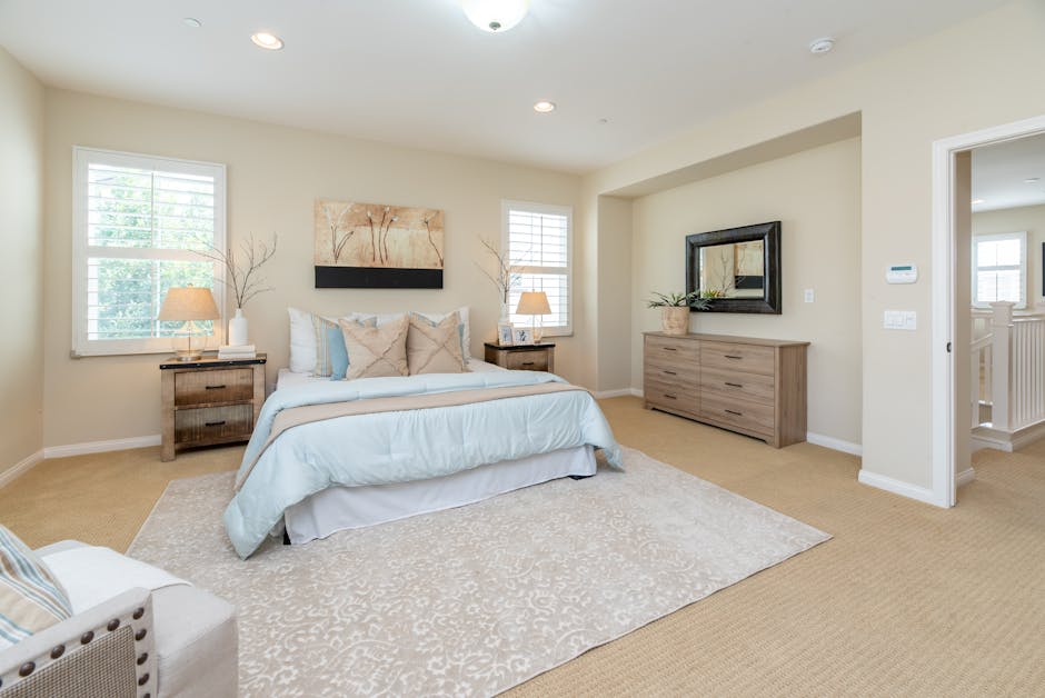
Neutral color schemes offer timeless elegance while creating the perfect backdrop for relaxation. Think beyond basic beige and explore the rich world of sophisticated neutrals: mushroom gray, warm putty, soft taupe, and creamy vanilla. These colors connect you to nature's most calming elements—sand, stone, and driftwood.

A carefully curated neutral palette allows you to introduce texture and pattern without overwhelming the space. Imagine linen curtains in warm ivory, a chunky knit throw in oatmeal, and a jute area rug that grounds the entire room. These natural textures in neutral tones create a sensory experience that promotes relaxation through both visual and tactile elements.
Layering different shades of the same neutral family creates sophisticated depth. Start with walls in a soft greige, add bedding in cream and champagne tones, then incorporate accent pieces in deeper mushroom or cocoa shades. This approach ensures your space feels intentional and cohesive while maintaining the peaceful atmosphere essential for quality rest.
The beauty of neutral schemes lies in their adaptability. You can easily refresh the space seasonally by swapping out accent pillows, artwork, or throws without disrupting the foundational calm your neutral base provides.
Gentle Green Sanctuaries
Green, nature's most prevalent color, brings the outdoors inside and creates an immediate sense of tranquility. From sage to eucalyptus to soft mint, green color schemes tap into our innate connection with the natural world. Studies by the American Psychological Association show that exposure to green colors can reduce anxiety and promote mental clarity.
Sage green walls create an instantly sophisticated backdrop that works beautifully with both warm and cool accent colors. Pair sage walls with crisp white trim, natural wood furniture, and touches of soft gold for a palette that feels both current and timeless. Add texture through botanical prints, woven baskets, and live plants to enhance the natural theme.
For those seeking something more dramatic, consider deep forest green as an accent wall color. This rich, enveloping hue creates a cocoon-like feeling that's perfect for relaxation. Balance the intensity with lighter elements—cream bedding, natural wood nightstands, and plenty of warm lighting to prevent the space from feeling too dark.
Eucalyptus and mint greens offer a fresher, more contemporary approach to green bedrooms. These colors pair beautifully with gray accents and brass fixtures, creating a spa-like atmosphere that feels both calming and invigorating. Consider incorporating these shades through bedding, curtains, or accent furniture rather than wall color for a more subtle approach.
Warm Minimalist Tones
Warm minimalism represents the evolution of stark, cold minimalist design into something more nurturing and livable. This approach embraces the clean lines and uncluttered aesthetic of minimalism while incorporating warm, comforting colors that promote relaxation. Think soft terracotta, warm white, gentle peach, and dusty rose.
A warm minimalist bedroom might feature walls in the softest blush pink, complemented by natural linen bedding in cream and a single statement piece—perhaps a sculptural ceramic vase or a piece of abstract art in muted earth tones. The key is restraint: every element should serve both a functional and aesthetic purpose while contributing to the overall sense of calm.
Dusty rose has emerged as a sophisticated alternative to traditional pink, offering warmth without overwhelming femininity. This versatile color works beautifully in both modern and traditional settings, pairing elegantly with charcoal gray, warm white, and natural wood tones. Use dusty rose sparingly—perhaps in throw pillows, a cozy armchair, or window treatments—to add warmth without disrupting the minimalist aesthetic.
Texture becomes crucial in warm minimalist spaces since color variety is intentionally limited. Incorporate different textures through your choice of fabrics, finishes, and materials. A nubby linen duvet, smooth ceramic lamps, and a soft wool rug create visual interest while maintaining the serene atmosphere essential for relaxation.
Creating Cohesive Color Flow
The most successful relaxing bedroom color schemes extend beyond wall color to encompass every element in the room. Research in environmental psychology shows that cohesive color schemes reduce visual stress and promote feelings of harmony and peace.
Start with your largest elements—walls, flooring, and major furniture pieces—and build your palette from there. If you've chosen soft blue walls, carry that color through in smaller doses: perhaps blue-gray curtains, navy accent pillows, or a subtle blue pattern in your area rug. This repetition creates visual rhythm that's pleasing to the eye and calming to the mind.
Don't forget about your ceiling and trim—these elements significantly impact the overall feeling of your space. A ceiling painted in a slightly lighter version of your wall color creates a cocoon-like effect, while crisp white trim adds definition and prevents the space from feeling too monochromatic. If you're pondering how to refresh a room on a budget, a ceiling color change and trim paint can make a huge impact.
Consider the 60-30-10 rule when distributing color throughout your space: 60% dominant color (walls, major furniture), 30% secondary color (bedding, curtains, larger accessories), and 10% accent color (pillows, artwork, decorative objects). This formula ensures balance while allowing you to incorporate multiple relaxing colors without creating visual chaos. For advice on decorating small spaces, remember that thoughtful color distribution is key.
Lighting plays a crucial role in how colors appear and feel in your space. Warm white LED bulbs enhance the cozy feeling of earth tones and neutrals, while cooler lighting can intensify the calming effect of blues and greens. Layer different types of lighting—ambient, task, and accent—to create a versatile environment that supports both relaxation and functionality. To further elevate your design, learn how to achieve a high-end look without spending a lot by focusing on lighting and cohesive color palettes. And if you're battling clutter that detracts from your serene setting, exploring stylish storage solutions for small homes can make a significant difference.
Conclusion
Creating a relaxing bedroom color scheme is an investment in your daily well-being and long-term health. The colors you choose will greet you each morning and embrace you each evening, making their psychological impact far more significant than any other room in your home. Whether you gravitate toward the timeless calm of soft blues, the grounding effect of warm neutrals, the natural serenity of gentle greens, or the nurturing warmth of minimalist tones, the key is selecting colors that resonate with your personal sense of peace.
Remember that the most beautiful color scheme is one that makes you feel relaxed and restored. Trust your instincts, consider the science behind color psychology, and don't be afraid to experiment with different combinations until you find the perfect palette for your personal sanctuary. Your bedroom should be a reflection of your best self—calm, centered, and ready for whatever tomorrow brings.